Arc: Lessons from a product that shouldn’t work
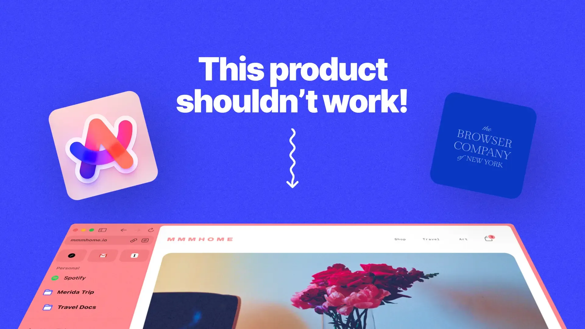
My friend chuckled when I showed him Arc. He’s a machine learning engineer, a technical purist who only finds products impressive if they’re breaking new technical ground.
Looking at Arc, he scowled, “A new web browser, huh? Because that’s what we really need, a new browser.”
His reaction was extreme, but most people outside of tech would probably react this way. If I told non-tech friends and family to replace their default web browser, they’d mainly ask “Why?”.
Arc is a quirky web browser built by a quirky startup, The Browser Company. The company’s quirks include building in a stale category for a TAM of everyone, competing with Apple, Google, and Microsoft as well as optimizing for feelings, not data.
These sound like I’m describing computer science majors high on their first reading of Peter Thiel’s Zero to One.
But The Browser Company’s team consists **of “Founders who sold their last company, ex-Instagram engineers, former Heads of Design at Tesla and Medium, multiple Google Chrome alums, a founding engineer of Amazon S3, alumni from Snap, Slack, and Pinterest, and so many other people who have done it before.”
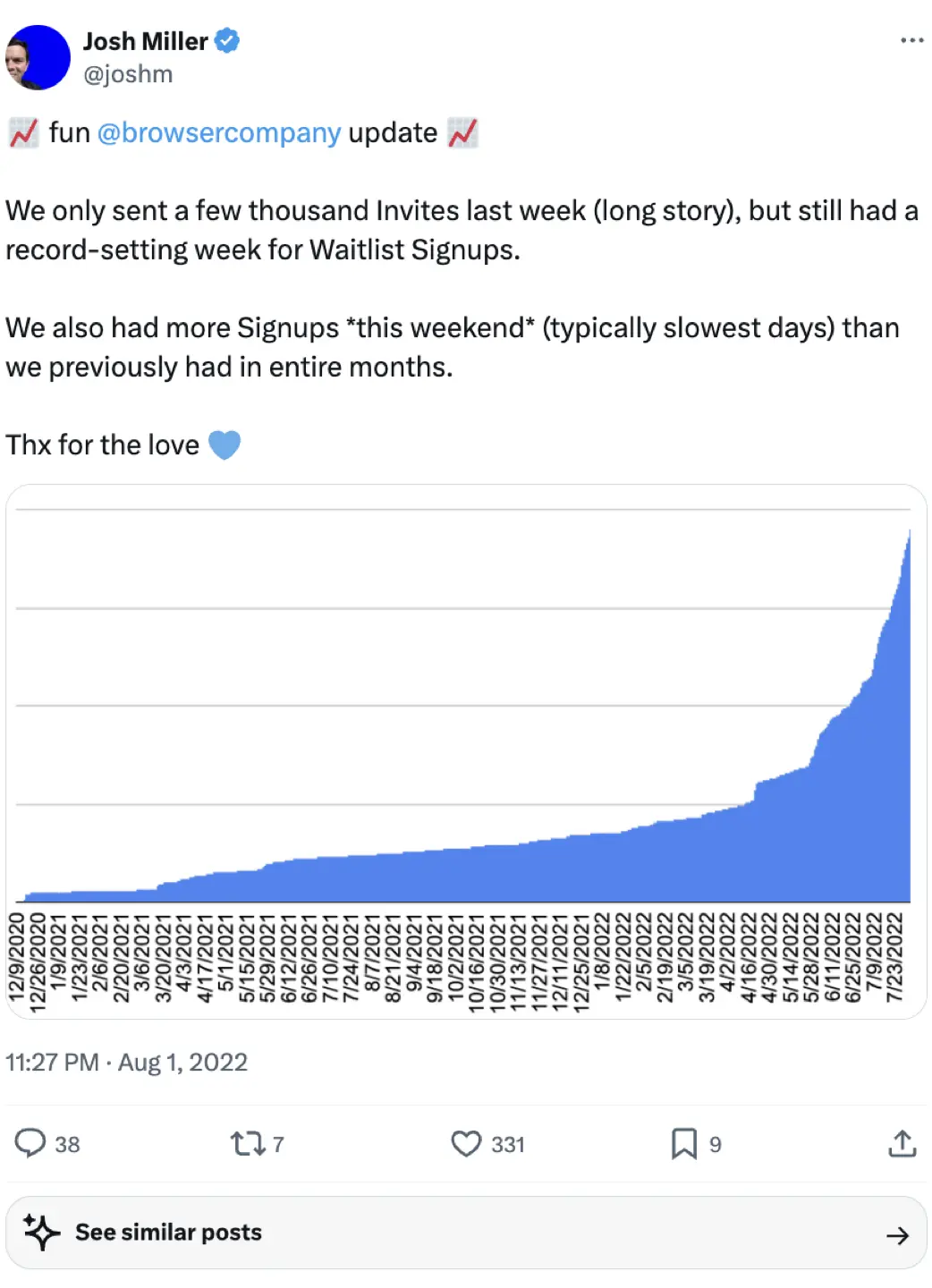
This is an all-star team swinging for the fences. And so far it looks like it’s working: Go to any coworking space and Arc seems to have replaced Chrome as the default. Its growth looks something like this:
In this article, we’ll explore the product lessons behind Arc: How it built a remarkable product that spread and created excitement while violating all of Silicon Valley’s dogma.
And any one-pager starts with “Why we’re building this”. In the case of building a browser in the 2020s, this is even more important.
Why on earth build a browser?
Arc is an internet browser, which is exciting if you’re reading this in 1995. Browser Company CEO Josh Miller agrees: “We can all agree that a desktop web browser is one of the most boring things anyone can work on.”
Before Arc, browsers felt like a solved problem: Nav bar, plugins, bookmarks, tab switcher, canvas for websites, UI done. Browsers are free, users aren’t complaining, nothing to see here.
Or is there? Every product category rests on fundamentals: The assumptions an industry makes about a category.
Anytime someone questions those fundamentals by building something entirely different, they learn an expensive lesson (Uber for plants) or transform how that category works (Tesla).
And If you ask Josh Miller, he believes Arc will succeed because the tectonic plates of the browser category are shifting:
The internet’s job to be done has changed
I could do all my work from a web browser: Google Meet, Notion, Slack, Figma, Linear… they all run in the browser.
It makes the way I started in marketing feels archaic, I’d use the internet to find information. That information went into a Word file I’d then email out:
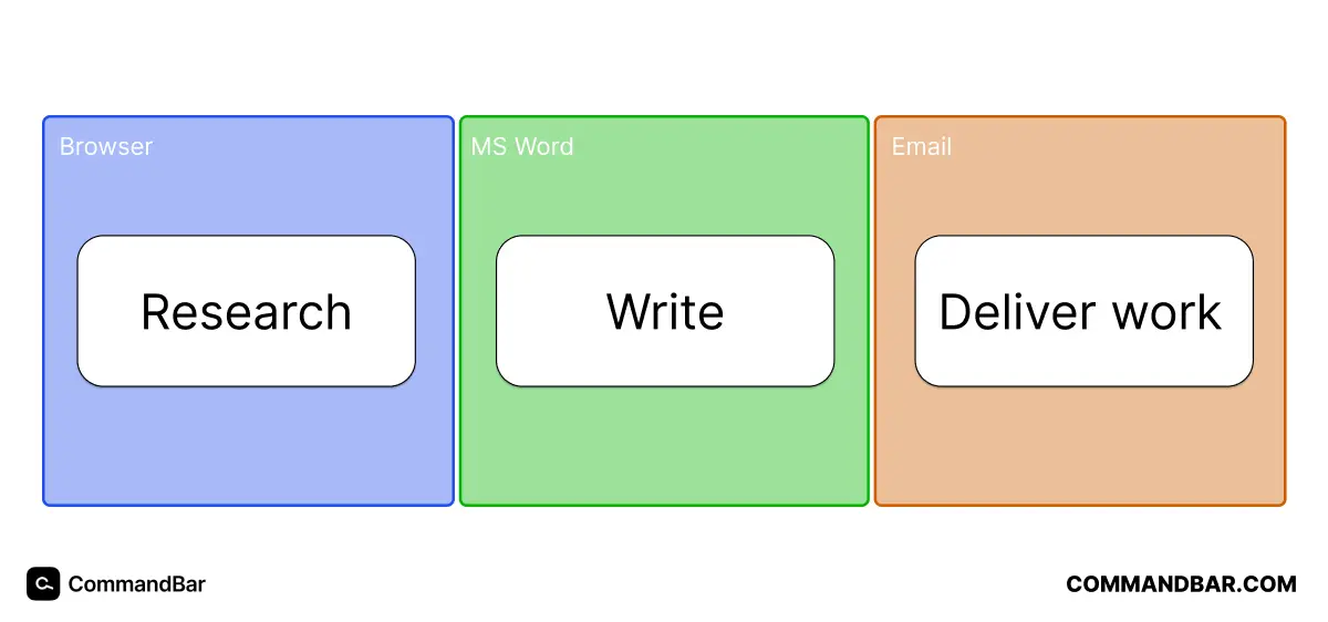
Today, I can do all of this in a web browser:
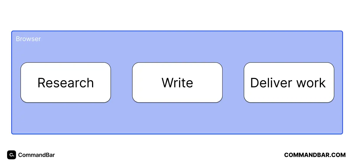
I might do research with Google, write in Notion and deliver my work in Slack, but it requires a single app on my computer. That’s because, thanks to cloud computing and data storage, browsers are apps than can run apps. Browsers are operating systems.
Arc embraces this fundamental shift: Web browsers have become operating systems, but browser-makers don’t seem to have noticed. This is why Arc’s interface is so perplexing at first, but immediately makes sense.
Categories transform all the time: Sometime in the 20th century, wristwatches stopped being tools and became fashion accessories. A diamond-studded watch makes no sense if you view watches as a time-telling tool, but are logical if you view watches as a status symbol.
View Arc as an operating system and its UI makes sense:
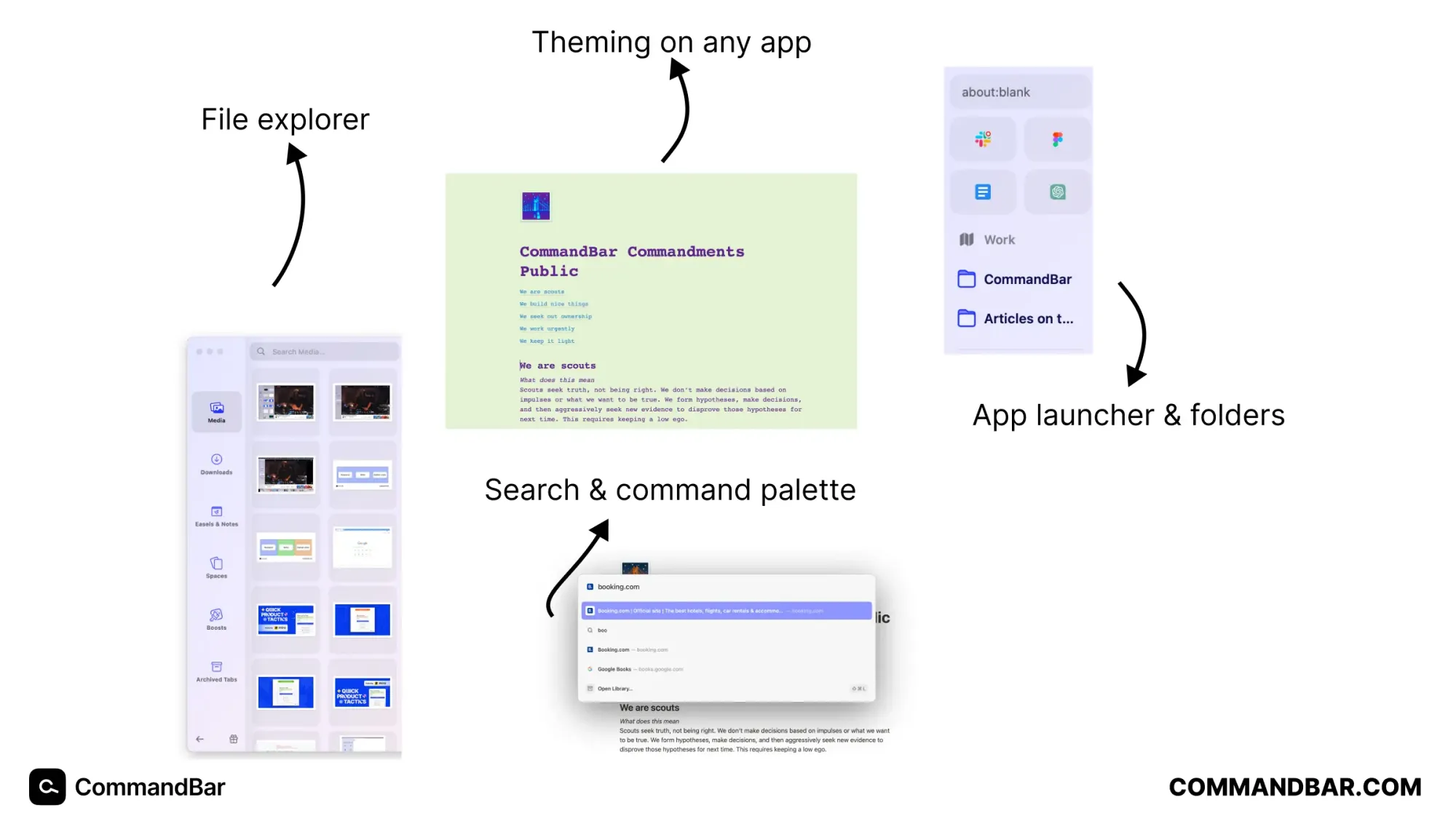
This is why Arc seems to refute Jakob’s law, which dictates that people spend most of their time in other apps, so you should make your apps look like most other apps. Arc looks nothing like other browsers, but is still weirdly intuitive because it does follow conventions: Those of operating systems.
Once you see the browser’s evolution, it stops looking like a stale category and becomes an opportunity to build a new operating system.
This insight is invisible to most, but pops up everywhere once you realize it. I suspect that’s why investors gave Miller and his team $18m to build what they call “a better way to use the internet”.
There’s a similar underlying dynamic for Command AI: Some years ago, we didn’t expect flawless UX (like we do today). We used fewer apps. We rarely had alternatives. This meant we took the time for each app. This has changed: User attention is most SaaS companies’ most important asset, which means we need to treasure it and make sure apps aren’t annoying.
Still, if the investors heard Josh Miller on podcasts, they’d wonder if he’s focused on the wrong things. If you follow Silicon Valley dogma, The Browser Company shouldn’t work.
Let’s explore a few ways The Browser Company builds product that look like obvious strategic mistakes:
Broken rule #1: Don’t try what’s already been tried
There’s a concept in Y Combinator called tar pit ideas: Tempting business ideas that have been tried multiple times—and have failed just as often.
They’re so tempting because they make (usually first-time) founders think “Why is nobody doing this?”. In rare cases, nobody’s doing it because it’s such a good idea and others don’t know yet. In most cases, nobody’s doing it because it’s a bad idea.
A few examples of this:
- Something that works perfectly fine, but on the blockchain!
- Uber for something people have no trouble finding
- Yet another social network
Browsers aren’t usually on this list. But that’s mainly because browsers seem like a solved problem. Google, Apple and Microsoft have a combined 88.59% market share:
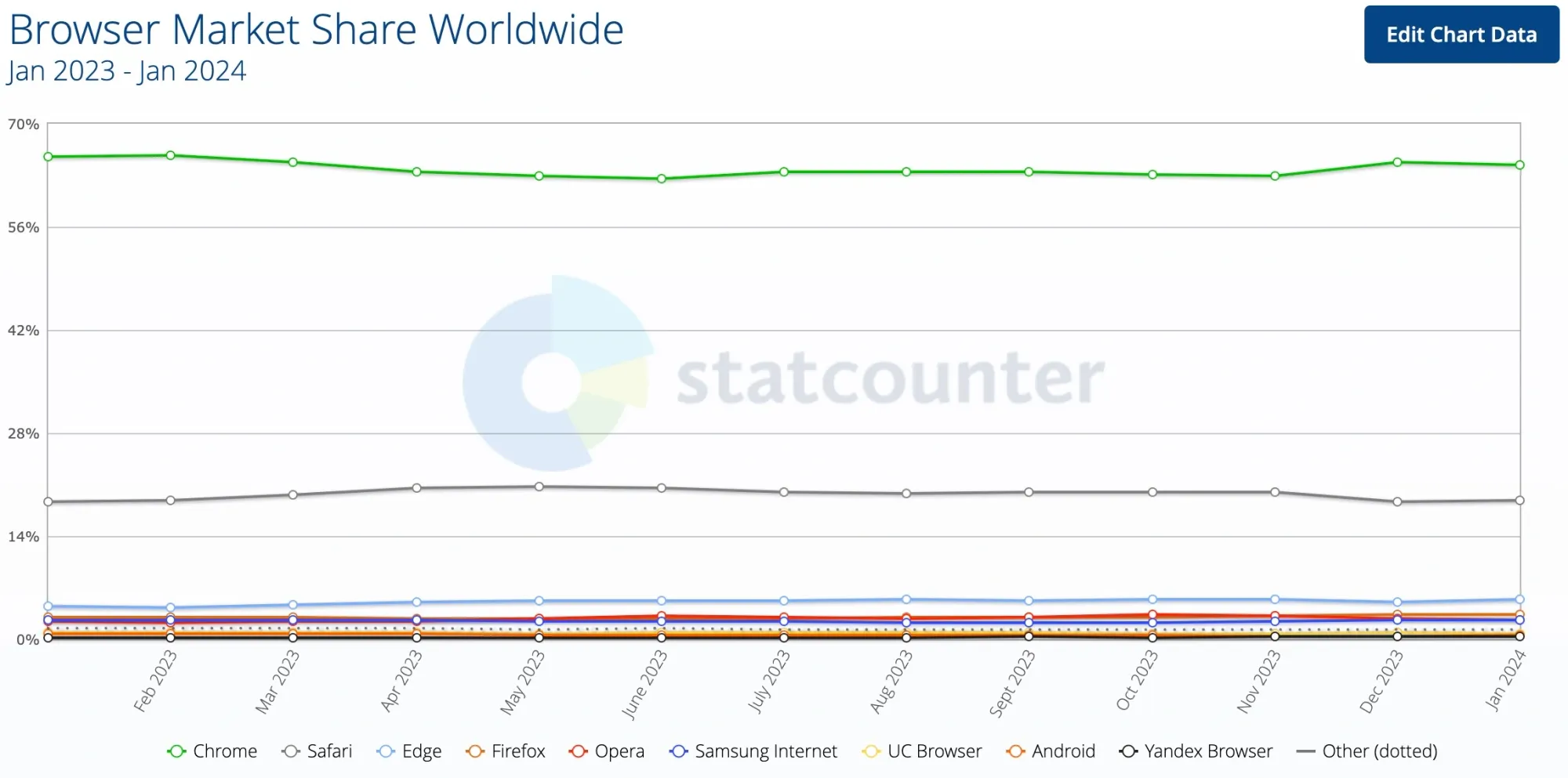
Even the most well-known alternative, Firefox, only commands 3.3% market share. If “Uber for X” is a tar pit, browsers are an active volcano.
So why does The Browser Company want to take on this space? There’s nuance to the tar pit concept. It doesn’t mean the idea is off-limits forever and to everyone. It means, in the words of Dalton Caldwell, “The bar is higher if you’re going to be working in this kind of space. People like trading, but they don’t like Robinhood—that’s not a compelling argument by itself.”
This is true. And the video that quote is from targets young founders applying to YC. The team at The Browser Company are the opposite of young, inexperienced founders. They’re some of Silicon Valley’s best talent—and they’re ready to meet that incredibly high bar.
And Silicon Valley’s biggest successes are usually incredibly hard business models (marketplaces, social networks) that tackle giant incumbents.
Broken rule #2: Follow the data
*Optimizing for feelings* is the title of The Browser Company’s attack on minimalism and data obsession. Silicon Valley is obsessed with increasing a number on a graph. New features and products usually start with user data.
The Browser Company starts with feelings—what emotion should the feature transmit to the user?
This sounds like a cute hobby to analytics-obsessed people. But it’s easy to forget that emotion drives user behavior.
Let’s say you launched a new feature. Behind every click on that feature is an excited, interested or curious user. Those are 3 emotions which lead to clicks. There’s a reason Reforge’s user psychology framework ELMR starts with emotion:
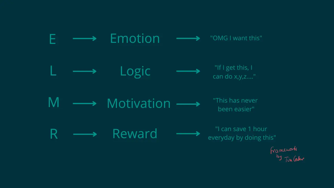
By designing to elicit emotion, you ensure the numbers don’t improve for the wrong reasons. If users only click on your feature to get rid of an annoying pop-up, that increases the chart while providing a worse UX.
In some sense, this is also what we build for at Command AI: We constantly talk about “user trust” and being “non-annoying”—not about engagement or retention metrics. That’s because those metrics are lagging indicators of user trust and non-annoyance.
Any one annoying pop-up won’t tank engagement. But if your users see 5 annoying pop-ups in a few days, their engagement will go down. The individual pop-ups effect on user trust is hard to quantify, but we start with what we want users of our customers’ products to feel: “Oh, an in-app message, this must be important!”
That’s user trust. And almost no chart could perfectly reflect this.
Broken rule #3: Building for everyone
Most successful tech companies start with a small market segment. PayPal was for eBay power sellers, Uber for tech execs in San Francisco.
The tenor goes like this: Corporations dominate the big markets and you can’t compete with them. In a smaller market, you can build a specialized solution that serves user needs better. This leads to better retention and more word of mouth. Once you dominate your tiny niche, we’ll allow you to expand.
The Browser Company builds Arc for everyone. This looks like a mistake, but isn’t:
We usually define segments by demographics: Age, job title, industry, hobby, etc. But how people believe and behave is often more effective than the categories we can put them in.
The Browser Company solves for this in a few ways:
- Self-selection: Because browsers are so pedestrian, only early adopters of new software will download Arc.
- Invite codes: Arc used to be invite-only. This meant Arc had to spread through networks that started with its founders, meaning it restricted the user base to vetted users.
- MacOS only: Before launching their Windows and mobile products, Arc was only available on MacOS.
Arc may not be explicitly built for a group of people. But the nature of the product selects for a small group. This enables finding product-market fit even if your product is theoretically for everyone. The same way Linear started as a Chrome extension, Arc’s product itself constrained who could & would use it.
Broken rule #4: You can’t out-corporation the corporations
One question that makes founders stammer is “What keeps [INCUMBENT] from building this and killing your business?“.
This is scary when the incumbent is a bigger SaaS company. It’s petrifying when you’re competing with Apple (Safari), Microsoft (Edge) and Google (Chrome).
The Browser Company’s strategy is sacrilege to the high priests of Silicon Valley.
Investors probably asked about the thousands of people working on Chrome alone at Google—can’t a simple redesign squash your company?
Josh Miller admits this keeps him up at night. He also believes big tech won’t replicate Arc because browsers drive revenue by showing you search ads:
- Chrome has Google as the default search engine
- Edge has Bing as the default search engine
- Safari has Google as the default search engine (for which Google pays Apple $20 billion)
That’s why owning a browser is great if you own a search engine. Ultimately, products need to make sense for the company’s economic engine. If a better browser means you see fewer ads, why build a better browser?
Many products users would love never get built because they don’t fit the business model of who could build them. That’s sad, but it’s also an opportunity for renegade startups like The Browser Company.
At Command AI, we don’t directly compete with giants like Apple, Google or Microsoft. But we do compete with companies’ in-house resources: Why buy when you have an armada of engineers to build in-house?
We know companies could build things in-house (we had a slide on that in our seed deck). But we also know it’s not their full-time thing. They’d never build behavioral triggers or the ability to detect when a message was irrelevant to the user. Not because they don’t care, but because it’s not how they make money (which is what they focus on).
Which rule to break next?
I could keep going here: The Browser Company has many more quirks and subverts many other product-building “principles”. Yet, as we’ve seen, Arc (and the way it’s built) start to make sense when you consider the evolution of the internet and browsers.
Josh Miller also emphasizes that what works for the Browser Company might not work for everyone else. Building something as “boring” as a browser requires standing out, which makes building for emotion necessary. An app that’s more geared towards a specific target market (e.g. accounting software for dentists) might not need to stand out for its design.
What I admire most about The Browser Company is their commitment to question assumptions and derive their way of building product from first principles. This might not be great advice for everyone. But if you’re swinging for the fences, it is.
Perhaps the best way to summarize The Browser Company’s paradoxical success is a Picasso quote: “Learn the rules like a pro, so you can break them like an artist.”
And if you want to not worry about building in-product experiences from scratch, book your Command AI demo today:
