Pages that land: How 5 B2B SaaS startups nail landing page copywriting
To most people, B2B landing page copywriting sounds as exciting as hospital cafeteria food. It sounds like that meeting topic you gloss over and think "I can wing this one without prep".
But it matters: The copy on your landing page is the first thing many users see. It determines whether they sign up (or book a demo) or close the tab and become a customer of a more eloquent competitor.
That's why landing page copywriting can be contentious: In my last role, I got caught in the crossfire between an SEO specialist, product manager and SDR fighting about the perfect product descriptors and whether to label the CTA a “specialized demo” or just a “demo”.
The SEO specialist wanted to rank on the first page of Google, the product manager wanted to accurately describe the product features and the SDR wanted to make sure prospects could easily book a demo. 3 different priorities with one shared goal: Generating conversions.
I didn’t like any of their ideas. Their suggestions were mechanical, not conversational and engaging. As I researched competitor pages, small B2B SaaS product landing pages and legacy B2B landing pages, I noticed some big problems with B2B landing pages - and I'll explain them to you in this article.
If you're reading this, you might've been asked to write B2B landing page copy as a non-content or copywriter. Maybe you're in the middle of a marketing site redesign and want to know what good looks like. Maybe you want to clarify your own startup's value prop and accelerate growth.
In this article, I’ll walk you through the problem with B2B landing pages, and what makes a good landing page and highlight five good B2B SaaS landing pages. Then we’re going to put it in practice and write our own B2B landing page copy.
The problem with B2B landing pages
I have identified two main problems with B2B landing pages, companies often hide behind meaningless words which add nothing to the reader and companies often fail to communicate the product value to users.
Hiding behind meaningless words
It's almost a stereotype: B2B companies hide behind meaningless words. Phrases like "innovative solutions" or "cutting-edge technology" in these contexts are meaningless. They don't explain what the product does. When you use broad and generic phrases, you don't clearly communicate your company’s value proposition.
“Innovative solutions” offers no tangible information that tells the reader what sets your product or service apart. It fails to explain your product’s offering. Instead of saying "innovative solutions” you could more specific language like "AI-powered analytics to visualize customer data”. With this copy, your customers understand what your product does.
Fails to communicate product value effectively
Some B2B landing pages use specific, clear language, and describe the main product features but they fail to communicate the product’s value effectively. For instance, B2B businesses fail to highlight how their product solves specific problems and meets the user’s needs.
In the example, I stated above “AI-powered analytics that visualizes customer data”, this is a good descriptor of the product, but I haven’t communicated the product value. If a user reads, they’ll know what the product does, but they won’t know how the product can solve their specific problems or meet their needs.
To communicate the product value effectively, I could go on and write “Enable your team to identify customer trends 5x faster”. Here, I’ve told the user that by using this AI-powered analytics tool, they can identify customer trends 5x faster. Providing the product value to the user can be the justification for why they decide to follow through with the purchase.
What makes a good landing page?
A good landing page is all about the five Cs: clarity, conciseness, consumer focus, conversational and compelling call to action (CTAs).
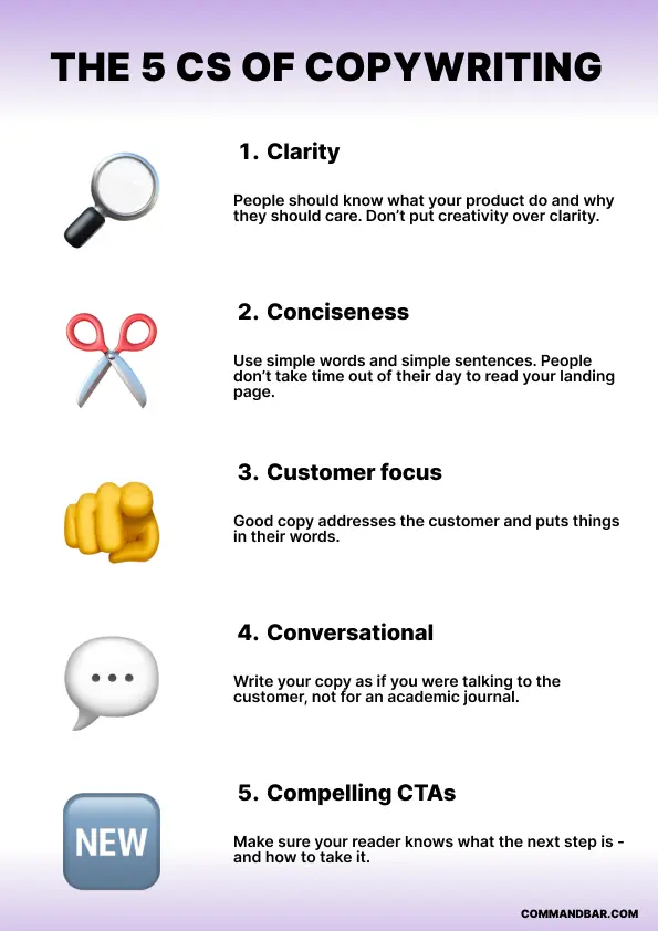
Clarity: You want to be as clear as possible with what you’re trying to communicate.
Say what your product does with clear and straightforward language. Uncertainty is the difference between a successful conversion and a lost lead.
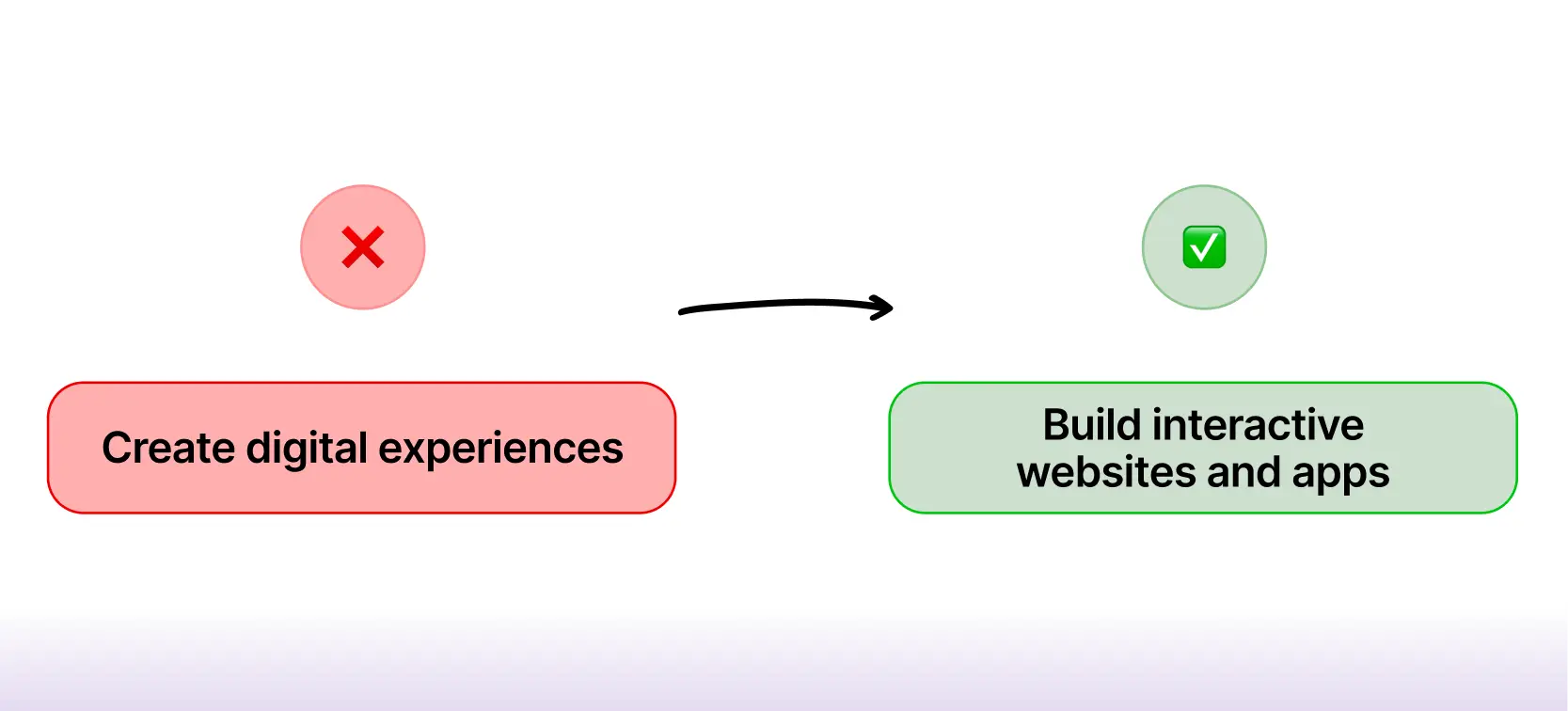
Let’s say your product is a no or low-code app builder, what subheading are you going to go with? “Create digital experiences” or “Build interactive websites and apps”.
Personally, I think “Create digital experiences” is quite unclear, what is a digital experience? It’s quite vague, plus It doesn’t communicate to your users that they can build apps and websites.
Conciseness: Get straight to the point, with simple sentences and no technical jargon. Most users are skimming landing pages and need to grasp key messages quickly to make a decision promptly. Personally, I think you should be able to convey your key message in less than 15 words.
Let’s imagine I’m writing copy for a customer data platform. Here’s how I’ll write the product’s key message in less than 15 words.
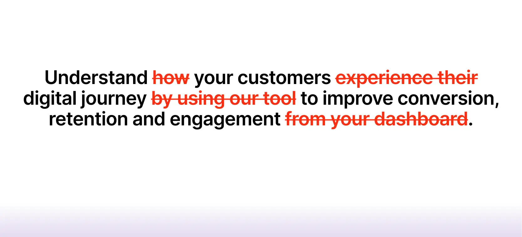
“Understand your customers’ digital journey to improve conversion, retention and engagement”
I’ve told the users what they can gain from the product (understanding the customer journey) and how the user will benefit from the product (improve conversion, retention and engagement)
Consumer focus: Explain how users can accomplish their goals by using the product or service. Users want to know how a product is going to solve their problems. Statistics and ROI measurements help demonstrate points effectively.
Using the example of the customer data platform, here’s how I’ll explain how users can accomplish their goals.
“Save up to 40% of your team's time by centralizing all your data in one platform. No more wasting hours pulling data from multiple touchpoints”
As you can see, users now know how this customer data platform will solve their problem. Their problem is twofold, the data is sourced from multiple touchpoints and it takes hours to pull that data.
Conversational: Write in a tone that feels natural and approachable, as if you're having a one-on-one conversation with the user. Torrey Podmajersky, author of Strategic Writing for UX says UX writing should be “recognizable to humans as an interaction they are having with the words”. The same applies to copywriting.
Your landing page needs to convince a user why they should use your product, but it’s not a synchronous conversation like a sales call or demo, it’s async. You need to adopt a conversational tone that sounds like a conversation between two knowledgeable co-workers. I’ll show you some examples.
Compelling CTAs: CTAs should be clear and aligned with the user's journey. Whether it’s signing up for a trial, exploring more features or contacting sales, your CTAs should prompt specific actions that lead users towards their goals.
It’s up to you to decide what you want your CTA to be— there’s no one size fits all. Crafting CTAs depends on your company’s specific user journey mapping. You might want customers to book a demo or you might want them to jump straight into a trial and you’ll engage them during the demo stage.
However, you need to make sure that your CTAs are compelling. In a previous role, I switched a CTA from “Book a demo” to “Book a specialized demo”, which led to a 38% increase in demos within a week.
My (unproven) theory is that users felt more persuaded by the word “specialized” as it implied a tailored experience that addressed their unique needs.
Now that we’ve gone through the basics. Let’s take a look at 5 B2B companies that got their landing page copy right.
Ramp
I love how clear Ramp’s copywriting is. When you click on the landing page, the first heading you see is “Spending made smarter”. This heading immediately communicates Ramp's core purpose: to improve spending efficiency.
Within 5 seconds of viewing the landing page, the user knows what Ramp does.
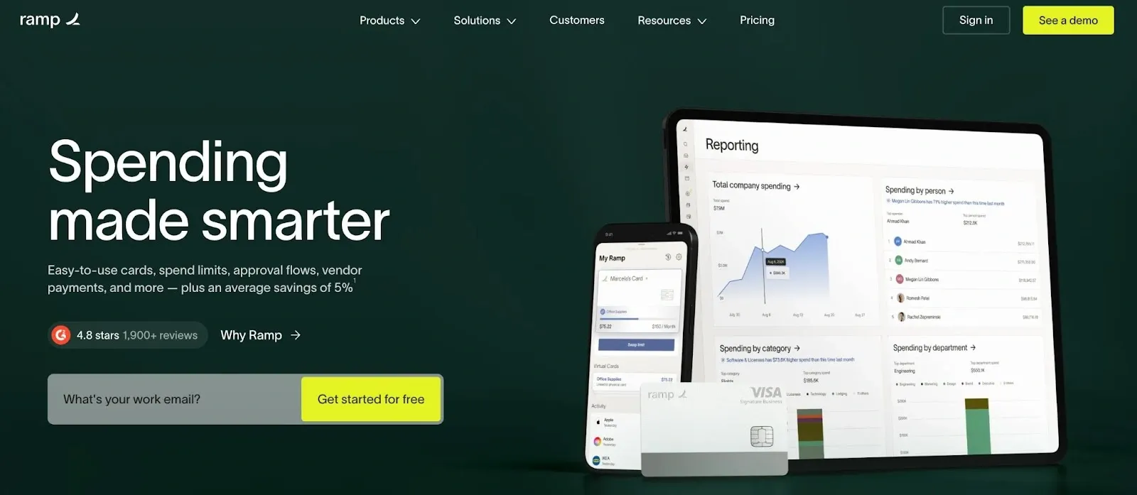
Without scrolling the page, I also know that Ramp offers the following (and more) features: accounts payable, expense management and travel payments. The CTAs directly underneath are also very clear and direct. I can get started for free or contact sales.
As I scroll down the page, the copy feels like a conversation. This helps users understand the flow of the copy. It feels as if the landing page copy anticipates the user's next question.
I’ve just read about the features Ramp offers, including the spending cards, and I see the text, “the card is just the start” and I can also see what other features are available.
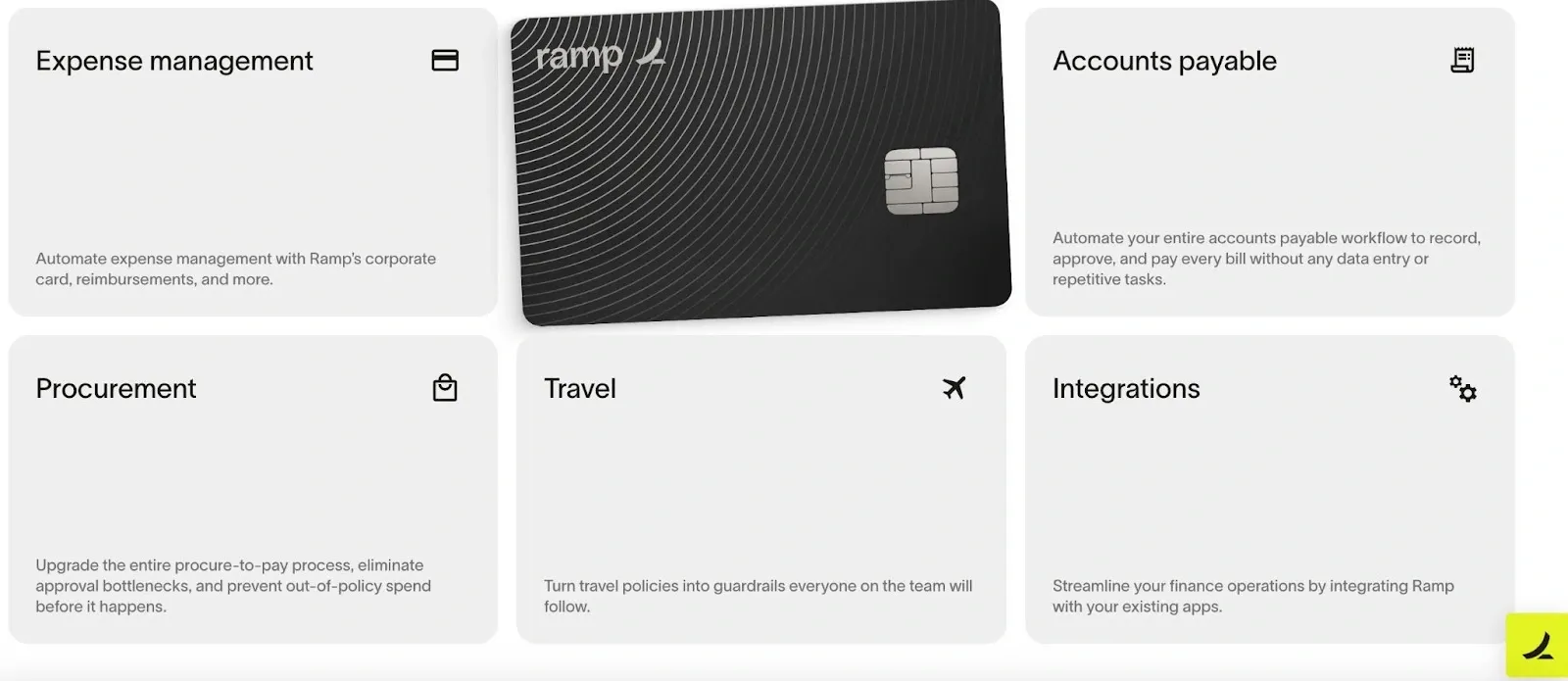
The microcopy underneath the individual product features explains the functions concisely. In approximately 12 words, I’m aware of each product feature and how those features can be potential solutions to my problems.
Ramp’s UX writing is conversational, clear and concise but I do have one criticism on Ramp’s landing page, “Save an average of 5% with ramp” with a footnote. It’s not clear to me what I’m saving. Is it interest, or transaction fees? This particular benefit isn’t clear.

Causal
Sticking to the financial sector, let’s examine the business planning platform Causal. Although Causal’s UX writing is more verbose than Ramp’s, it remains clear and effective. The first heading, “The finance platform for startups,” immediately communicates its target audience and specifically emphasizes the focus on providing financial solutions tailored to startups.
It’s wise to immediately communicate your core audience on your landing page because the last thing you want is an underqualified lead in your sales pipeline as an SDR and you’re wasting time with a sales sequence. By underqualified lead in this specific situation, I mean a small business.
If the audience wasn’t communicated effectively, small business owners might feel that the platform is suitable for them when the product is geared more towards enterprises with complex business planning needs.
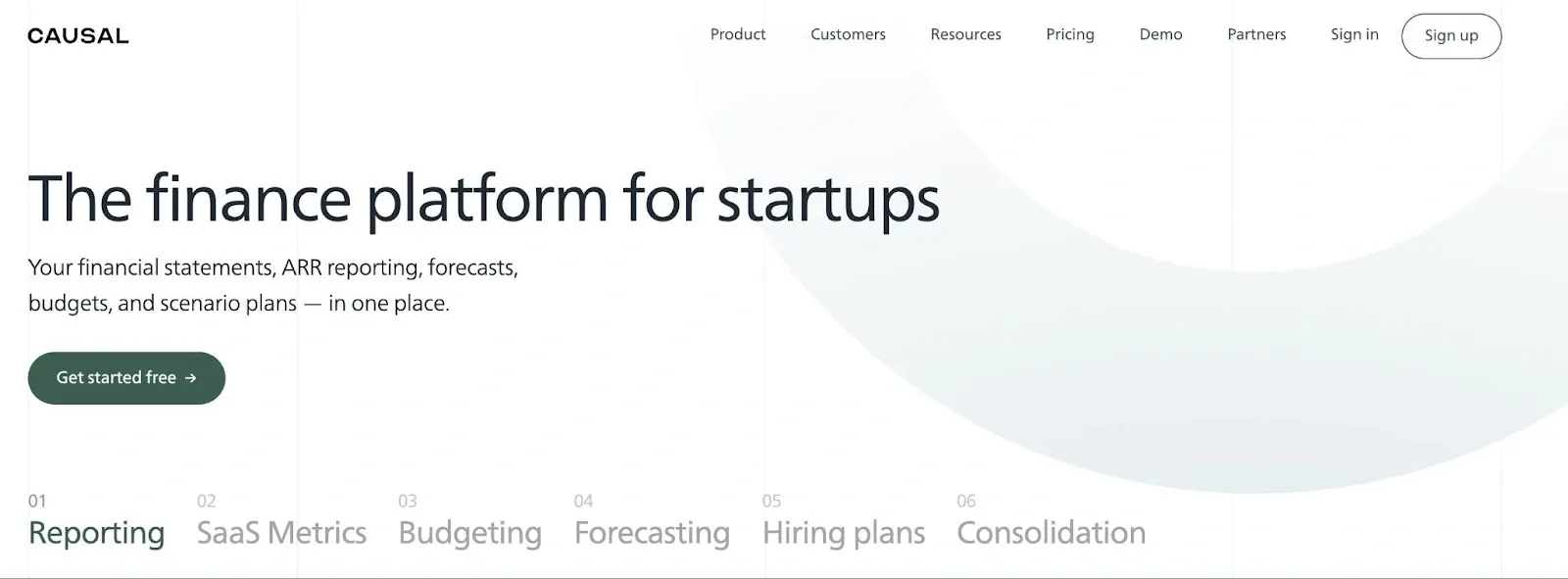
Directly underneath the heading, I can see what tasks I can carry out in Causal. I can create financial statements, ARR reporting, forecasts, budgets etc. I find Causal’s choice of CTA interesting, unlike Ramp which offers users the option to book a demo or get started, Causal just offers the option to get started. However, the sign-up is free. Causal has thought about the user journey, and will possibly engage users during the trial stage rather than during the demo stage.
Causal also feels like a casual conversation, especially with the heading “How did we spend so much on contractors last quarter?”. This direct question makes me feel like I’m having a conversation with a colleague.
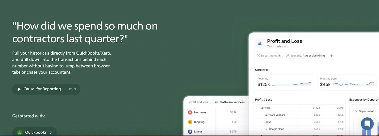
Like Ramp, the microcopy underneath the individual product features explains the functions concisely. The CTA “explore all features” underneath the product features aligns nicely with my user journey. Instead of frontloading all of the features on the page, Causal has listed the most important ones first and gives me the option to explore further.
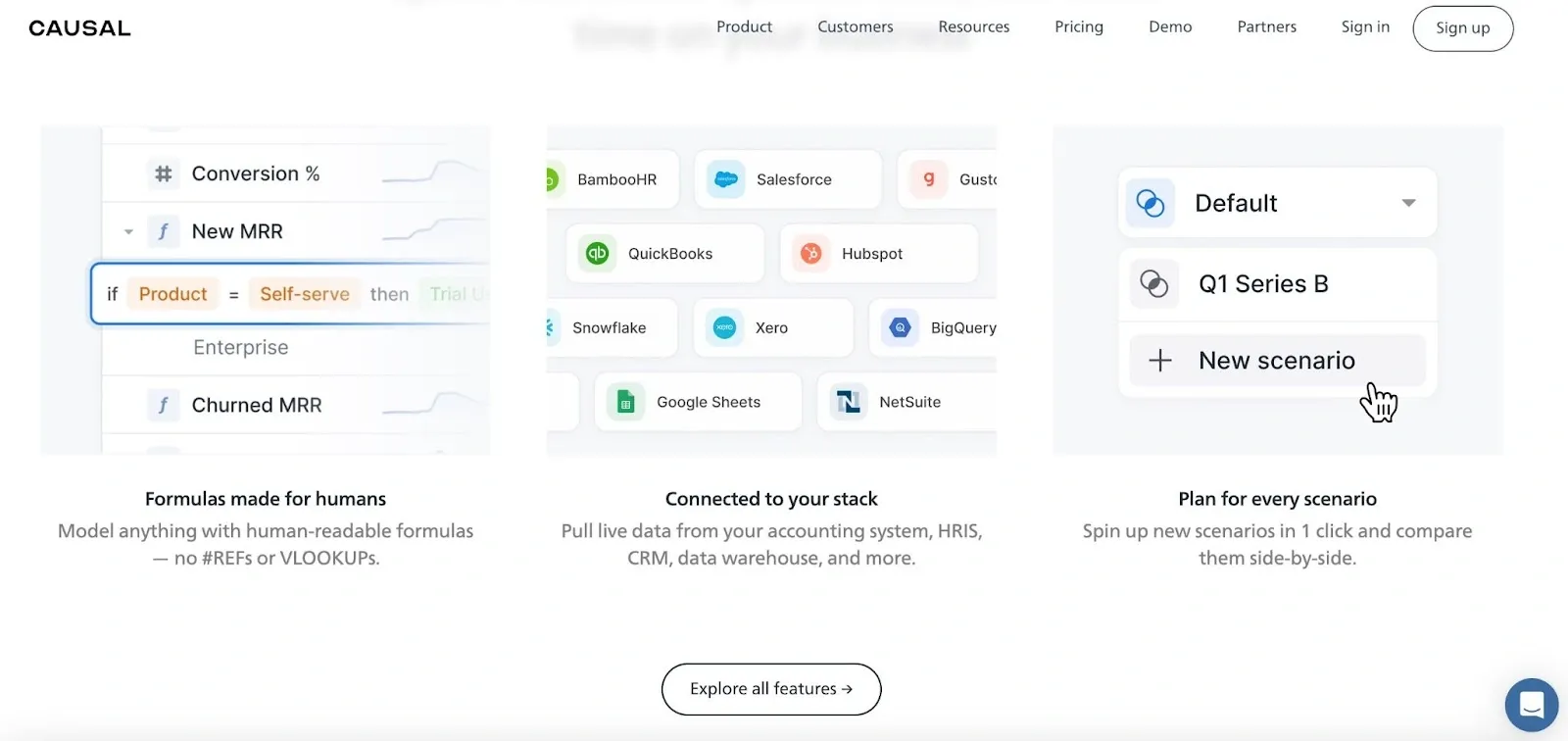
Even though Causal’s UX writing is on the wordier side, it has an engaging, chatty, conversational tone with clear and concise language. Although financial and business planning is a technical topic, there’s no overkill of technical jargon. Even if your audience is technical, you want to communicate in the simplest language possible.
Posthog
Open-source product analytics platform Posthog tops the list in terms of mastering a conversational tone in its copywriting. Posthog’s approach is comical, yet engaging, serving as a reminder that B2B copywriting doesn’t have to be boring!
(for a full breakdown of PostHog's product strategy, read our deep dive)
Although Posthog’s core target audience is highly technical, its copy makes product analytics sound accessible to all. Like Causal, Posthog goes straight in by communicating who their target audience is with the heading “how developers build successful products”. I know that as a non-developer, this product isn’t for me, but if I were the procurement manager at a company, I’d also consider that this product might be suitable for the developers at the company.

Underneath the messaging heading, I can see what tasks I can do with Posthog. I can analyze, test, observe and deploy new features. Posthog’s CTAs underneath the subheading text are compelling. I like the choice of the verb in the CTA “get a demo”, because it maintains a casual tone and encourages immediate action. This conversational approach makes the process feel straightforward and user-friendly.
Let’s look at the customer case studies section. “These folks build products users want with Posthog”. Again, Posthog maintains its conversational tone, which makes the content very relatable and engaging. The use of "these folks" is informal and friendly, which makes me forget that Posthog is selling me a product, it sounds like a conversation.
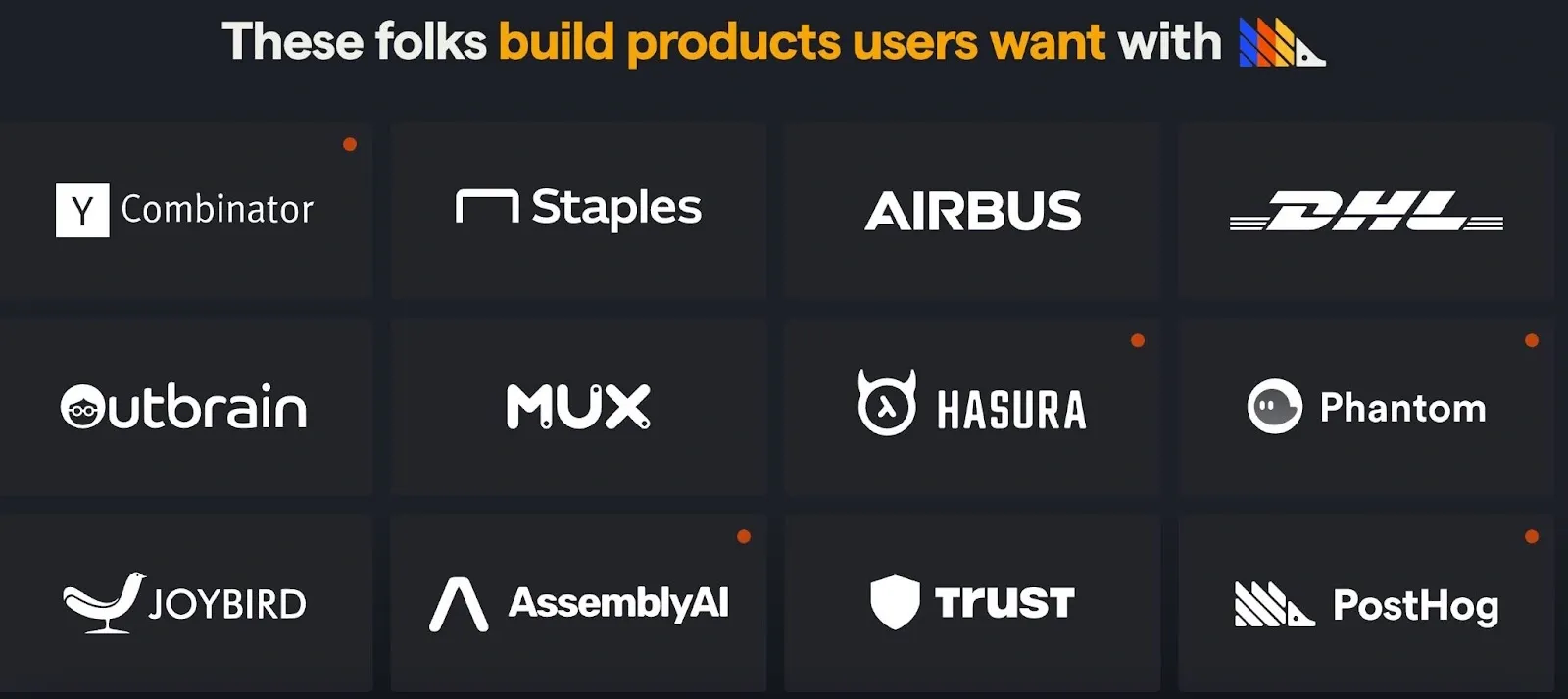
Overall, I think Posthog does the best job in humanizing their brand and it reflects through very fun and engaging copywriting that can make users forget that they’re about to enter a business relationship.
Linear
Project management tool Linear demonstrates how powerful clarity can be in B2B copywriting. While Posthog and Causal bring conversational and playful tones to the table, Linear delivers clear, concise copy that speaks directly to its audience. The language is sharp, precise, and perfectly aligned with the product’s purpose and users.
(Want to know why Linear is so damn popular? Read our deep dive!
When I open Linear’s homepage, I’m immediately struck by the heading “Linear is a purpose-built tool for planning and building products.” The core use of the product is immediately clear. As I scroll down the page, I see that Linear is “made for modern product teams,” making it evident who the intended audience is.
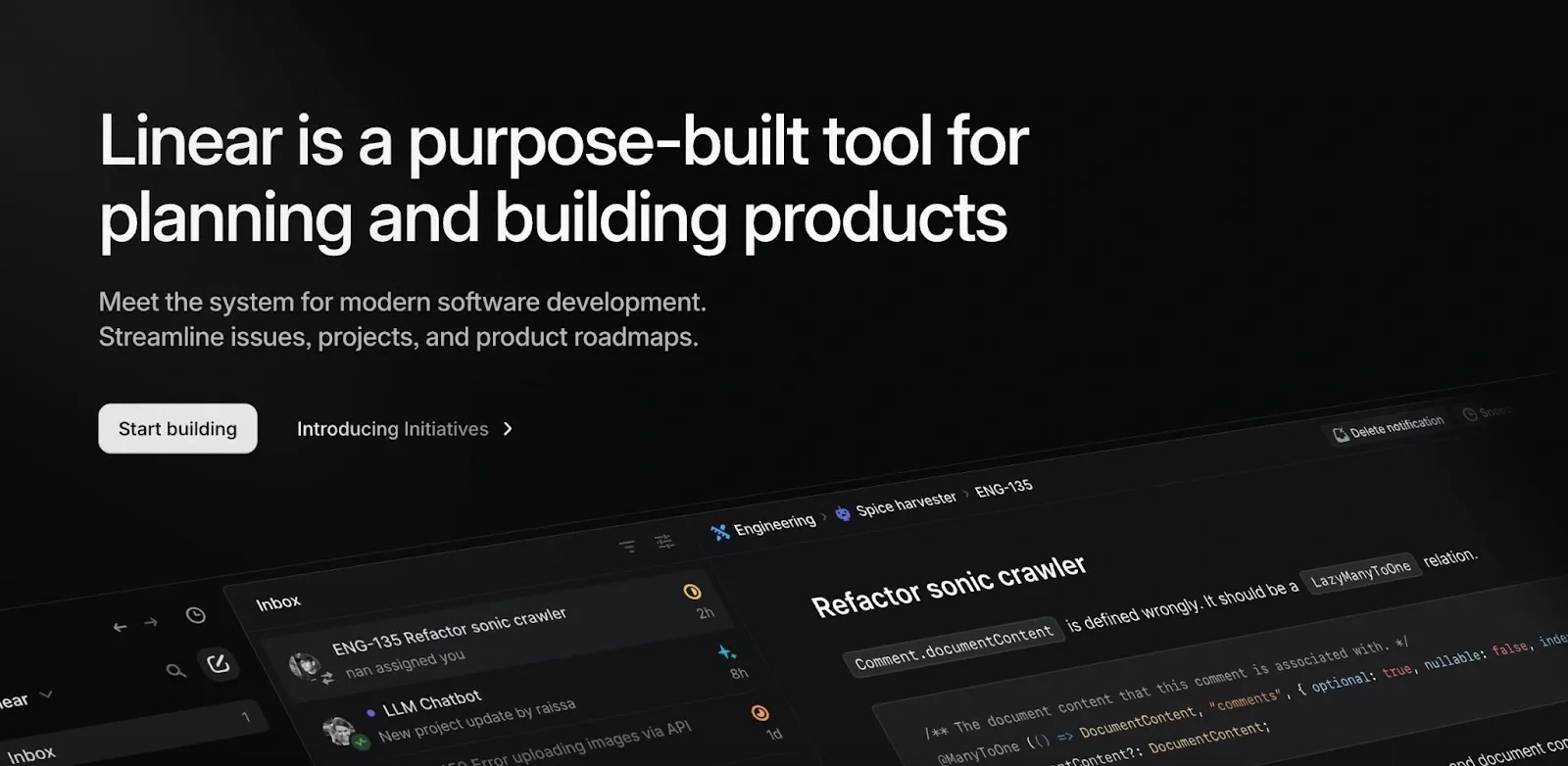
Linear’s approach to copywriting reflects a deep understanding of its users’ priorities. The copy is centered around the tasks users seek to accomplish, using phrases such as “Create Task,” “Build,” and “Review,” which directly relate to user actions. Each line is packed with information that conveys the product’s value, driving me towards action without overwhelming me.
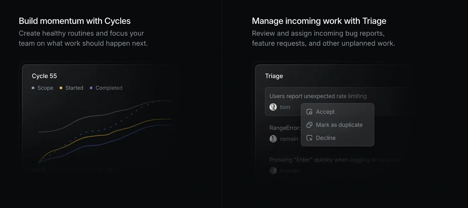
But what really sets Linear apart is how it intertwines this clarity with a compelling company narrative. Linear isn’t just selling a tool; it’s selling a vision of streamlined, efficient, and modern product development. This clear, authoritative tone not only builds trust but also aligns with Linear’s broader story of empowering modern teams to achieve more with less friction.
Firstbase io
Firstbase.io is a platform that simplifies the process of launching and managing a U.S.-based company from anywhere in the world. I chose Firstbase.io as a strong example of effective copywriting because it exemplifies how clear, straightforward language can make a complex process accessible to a diverse audience.
Given that a significant portion of its users may be non-native English speakers, Firstbase.io’s copy is designed to be as simple and direct as possible without being condescending. There are valuable lessons here for anyone looking to create user-friendly content that resonates with a global audience.
When I land on the Firstbase.io homepage, I’m greeted with a headline that leaves no room for ambiguity: “Launch your US business from anywhere, in minutes.” This opening line immediately communicates the platform’s core offering, making it clear who the service is for and what it does.
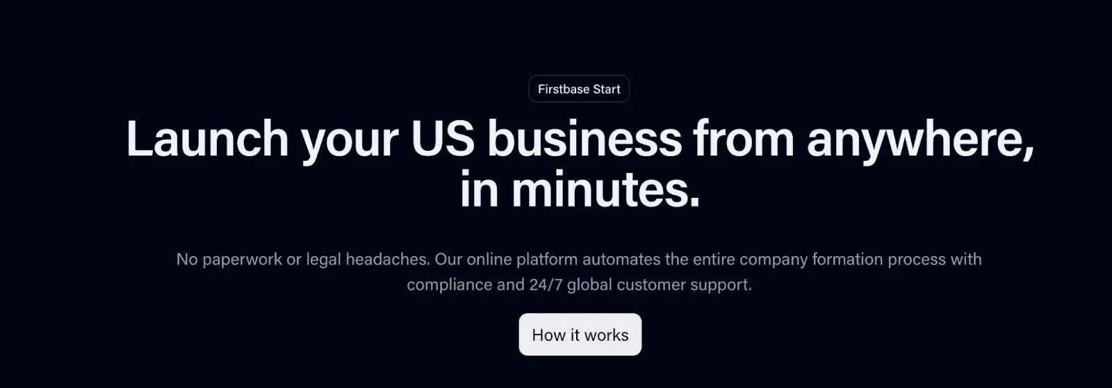
As I explore the site further, I notice that the copywriting is consistently geared towards demystifying the process. For instance, phrases like “Incorporate your business in just a few clicks” and “All-in-one solution” are used to break down complex tasks into manageable steps. This concise language builds trust, making me feel that I am in capable hands. You want your users to feel like they can trust your product.
Moreover, the copywriting is designed to make me feel supported throughout my journey. The use of phrases like “We'll guide you through” and “We'll give you a bank account faster without needing an EIN” reinforces the idea that Firstbase.io is a reliable partner, guiding me every step of the way. This level of reassurance is particularly important in a B2B legal context, where trust and reliability are paramount.


Let’s put it into practice
I’ve walked you through a lot, and now I want to show you how to put it into practice. Imagine I’m a B2B copywriter for a fictional product analytics company called Command Analytics.
My heading is going to be: “AI-powered analytics to visualize customer data”, and my subheading directly underneath is going to be “Made for product teams”. Further down the page, for the title component near the product features breakout box, I’m going to title it “Understand your customers’ digital journey to improve conversion, retention and engagement”.
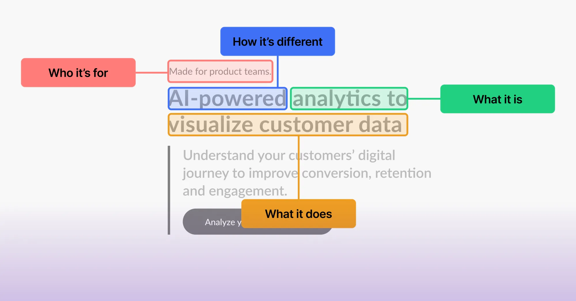
This looks simple. And it is! But it clearly checks all the boxes. The reader knows everything they need to know, even though the product is complicated.
This is the essence of good copywriting: Communicating the basics. Far too many companies get this wrong.
Conclusion: How to win in B2B SaaS Landing Page Copy
Effective B2B copywriting is more than just getting the words right, it’s a balancing act—understanding the unique needs of your audience and talking with them at every stage of their journey. Whether it's the playful, conversational tone of Posthog, the sharp precision of Linear, or the inclusive simplicity of Firstbase.io, the best examples of B2B copywriting share common traits: clarity, conciseness, and a deep alignment with user goals.
By focusing on the five Cs—clarity, conciseness, consumer focus, conversational tone, and compelling CTAs—you can create landing pages that communicate your product’s value effectively.
