You just rolled out AI chat - Should you delete your help center?
Explore the evolution of app help centers from 1980s FAQs to today's AI-driven solutions. Delve into how help methodologies have adapted over time.

Since apps have existed, so has help content. Back then, assistance on how to use applications was critical since many users were new to the Internet. The concept of a familiar UI wasn’t a thing—applications hardly converged on the same design language.
Even today, after decades of design evolution and some standardization of certain UI patterns, getting help on apps remains a top priority for companies. Today, we want to dive into the history of the app help center, which has taken various forms over the years.
The era of the FAQ
During the early 1980s, the invention of an FAQ (frequently asked questions) page happened when NASA needed to answer repeated questions about its mailing list. There have been books with FAQ-like sections for summarizing content since the 1600s, but in the context of Internet slang, the FAQ started in the 1980s.
The FAQ was created to address an annoying issue in which users would message the mailing list to ask questions about the mailing list (as opposed to searching the archives). It was an early indication of a phenomenon that’s continued till today: Users typically want to put in as little effort as possible to access help content.
Over time, FAQ pages began popping up on various websites, both consumer and commercial. I remember as a kid searching for “FAQ” on search engines to answer a question about a product I was using and then being flabbergasted when the seemingly common question I had wasn’t included.
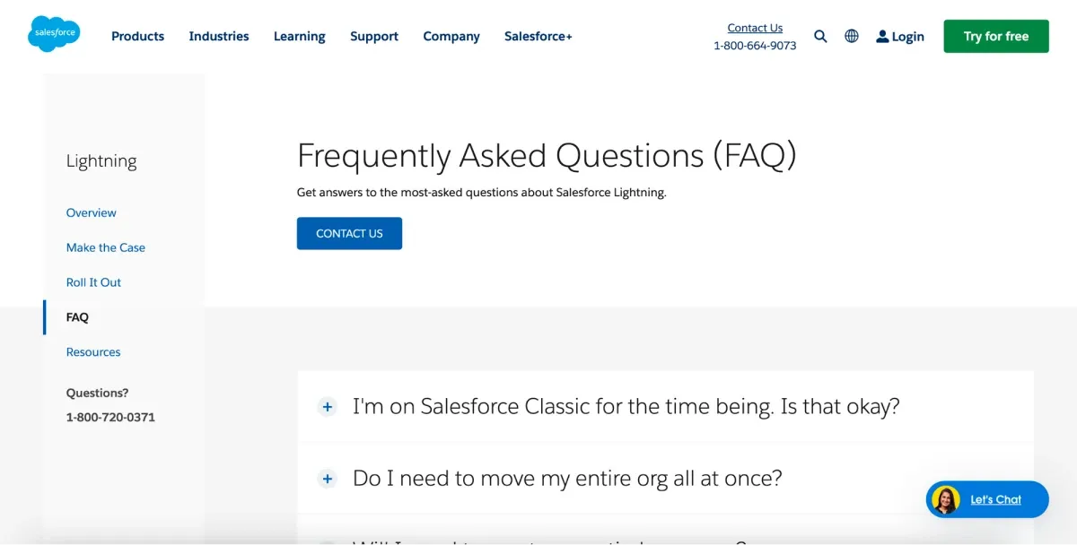
In retrospect, we could think of FAQ pages as early versions of the modern wiki-style help centers we see supported by Intercom, Zendesk, and Gorgias today. They were simple, not very searchable, and fairly bare, but they solved a majority of common complaints on a single page.
Physical and downloadable manuals and guides
Back then, FAQ pages were so simple because (a) it was expensive to host applications, and public-facing pages incurred bandwidth; (b) applications were harder to build, and the concept of embedded, third-party software was in its infancy; and (c) users were just learning about the web, so the premise of an FAQ page was not totally fleshed out.
On the flip side, applications were growing, becoming more niche and complex. To combat this, companies started offering physical manuals—eventually downloadable as PDFs. These manuals contained screenshots, step-by-step instructions, and tips to troubleshoot issues. We could think of a manual as a modern help center, just packed into an encyclopedic file.
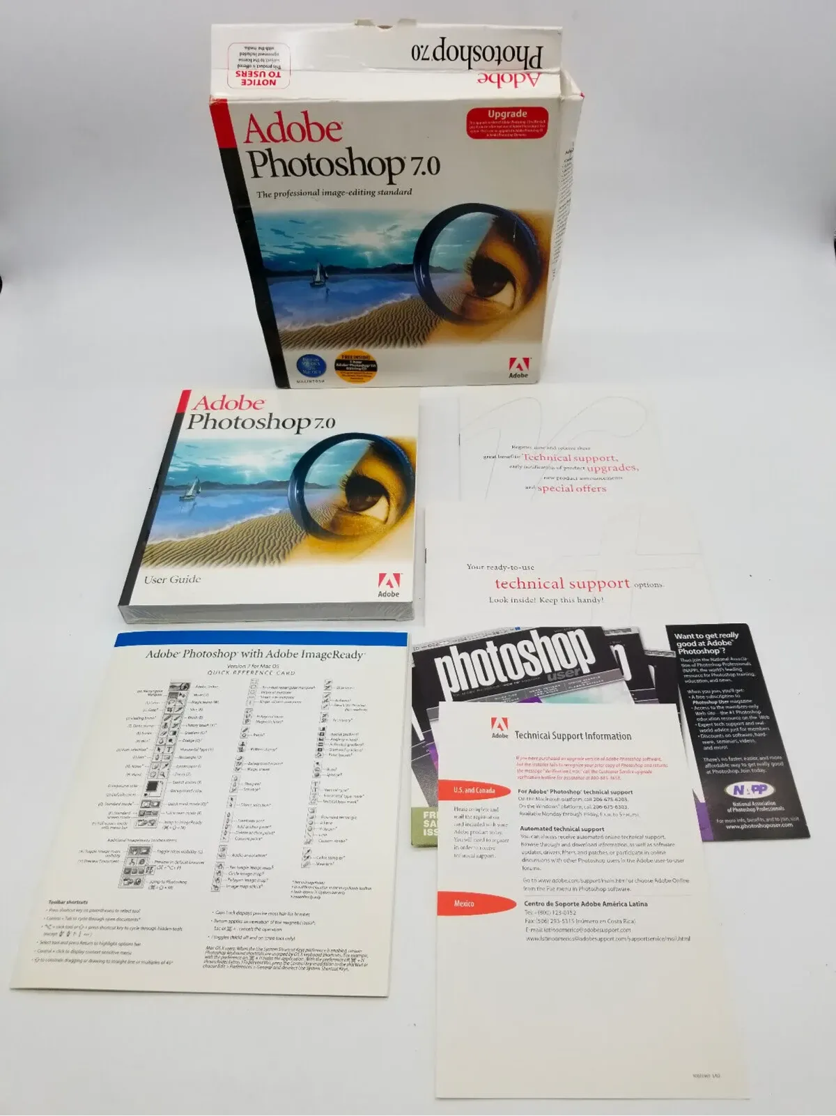
Popular software, like Adobe Photoshop and Microsoft Office, all came with these guides. As PDFs became more popular, physical books were replaced by massive digital documents.
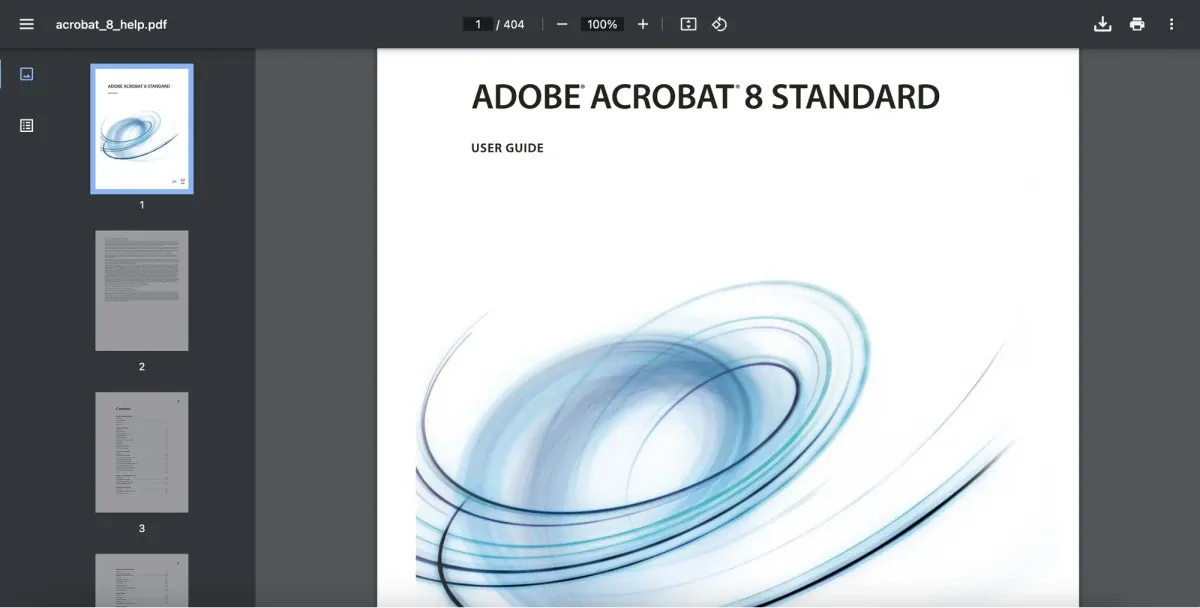
Unsurprisingly, nobody liked using them. They were tedious to search through and incredibly detailed. And whenever an application had a major UI update, the guide’s screenshots became out of date (hilariously, a problem that remains today).
Forums and community support
Another type of Internet website was being developed: forums. Originally called discussion boards (like bulletin boards), forums were places where users could create accounts and discuss specific topics.
While forums were about any niche interest, by the late 90s, forums for product evangelists evolved. These forums allowed successful products to harvest their users for help content. In them, newer users were assisted by veterans. One of the most famous ones was Creative COW, a 2001-founded forum where Adobe users hung out. Companies’ representatives would also monitor these communities to act as a voice of authority whenever necessary.
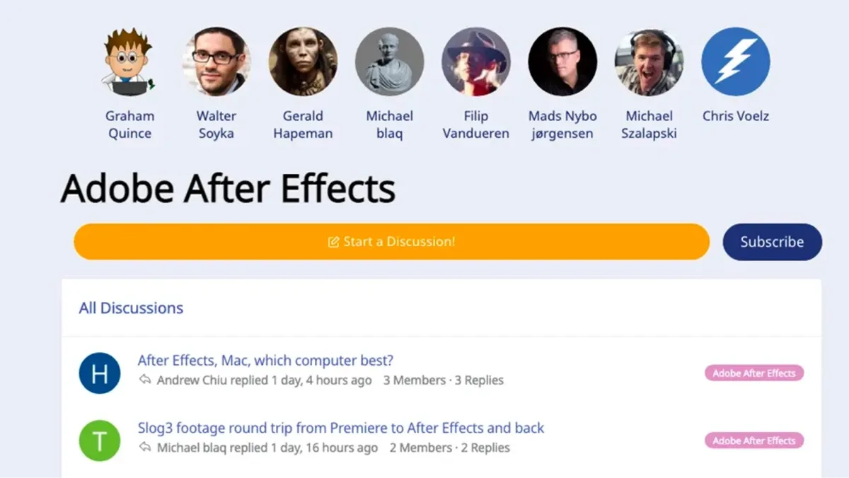
Even today, forums maintain a big role in support, particularly for errors that might not be covered in traditional tutorial guides. Then, and now, forums have helped inspire the ideal topics to be discussed in primary help content by identifying common points of confusion for users.
The one drawback with forums, however, was the lack of immediate help. Users weren’t guaranteed that their query would receive a timely answer, or potentially an answer at all. It all depended on whether or not the right person saw it. By extension, forums weren’t a valid strategy for companies to rely on. Regardless, it was and still remains a great resource for uncommon queries.
App help centers
Building on the foundation of the previous advancements, many apps began adding full-fledged help centers directly into their platforms. Powered by platforms like Zendesk and Intercom, these mini web apps combined FAQs, searchable knowledge bases, video tutorials, and step-by-step tutorials.
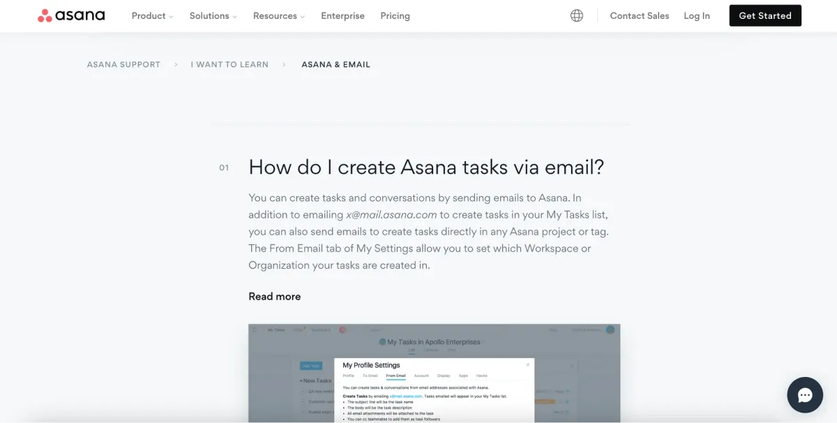
The app center has borrowed from the design of wikis. Wikis are particularly old, having their origins in the 90s, and were originally encyclopedias of general or niche information (Wikipedia being the most famous). The app center, inspired by the design of wikis, utilizes a structure akin to wikis, featuring interlinked articles and robust search functionalities, albeit tailored specifically to encompass all aspects of a particular app, and can be further enhanced with advanced wiki tools. App centers follow a similar structure to wikis—a collection of interlinked articles bound together by powerful search—and are instead focused on everything related to a particular app.
In-app help content
As help centers grew more popular, a vertical of SaaS grew: in-app help content. Help centers were basically wikis of help content, and they pulled users away from an application. This could cause users to become sidetracked or distracted, hurting engagement. This echoes the same reason why FAQs started, to deal with the fact that users want to be able to access help content as easily as possible.
There are two types of in-app help content—content suggested via chat and content suggested via in-app modals. Some apps have help bots in the corner; when users hit the chat for support, they’ll walk through a series of questions that’ll suggest which articles a user should check out.
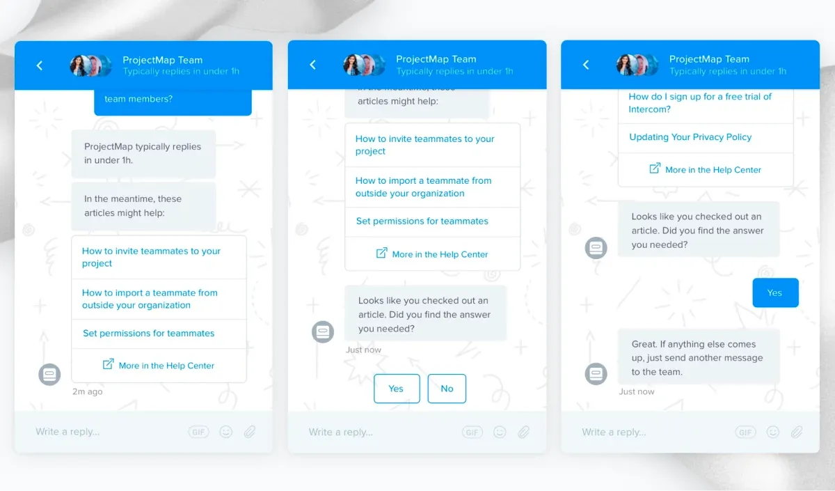
The issue, however, with chat-based suggestions is that they still require the user to query chat (i.e., work) and answer questions (i.e., work). So, apps like Command AI have evolved, enabling users to access help center articles by simply searching for them in the search bar and accessing previews of articles with the easy option to expand them.

In-app help content doesn’t replace app help centers; it just makes the content loaded within help centers easier to manage.
AI-managed help content is next
Today, everyone is talking about GPT. One of the best applications of GPT is help. In short, GPT can digest a corpus of help content and summarize or suggest content that is directly related to a user’s query. However, it can also help produce readable content based on structured data.
Accordingly, help content will be impacted in two ways by GPT. First, GPT will be used to summarize content dynamically for users—we’re already seeing this in products like our own, HelpHub, where content is summarized in-app for the user based on the query.
Second, GPT will be used by app help center software like Zendesk to enable product teams to better keep content up-to-date and readable. App help centers can occasionally be tedious to manage because articles naturally have overlapping content to prevent users from jumping too much around the product. GPT can fix this by (a) creating articles from a minimal corpus to knowledge managed by product teams and (b) spotting contradictions in the app help center to weed out out-of-date articles.
While we are still in the early days of GPT’s roll-out, the future is bright for help content.
Closing thoughts
The history and evolution of app help centers are amazing. From the era of the FAQ to the present-day advancements of GPT, help has come a long way. Just as fascinating, though, is how some help products are still around today despite being decades old. Sure, some things may be extinct, like physical manuals and 400-page PDFs. But today’s products still use a combination of user forums, FAQs, searchable app centers, and in-app help content.
At the end of the day, what matters is that users can easily access the help content they need with minimal work, and this design principle will only continue to inspire where app help progresses.
