In-app guidance and how it can help customer adoption
Tips and best practices to boost customer adoption and feature discovery with in-app guides.

You've probably had this happen: You sign up for a new product, find yourself in the dashboard and... what now? You're convinced that any minute now, a tumbleweed will roll over the screen.
Dropping your users into the product with no explanation basically means your adoption strategy is "hope for the best". But it doesn't have to be that way.
If you implement simple in-app guidance, you'll help users learn your product faster than they would if you simply left them alone like a paratrooper behind enemy lines.
In-app guidance can encourage customer adoption and introduce users to features within your software without in-person training.
Key Takeaways
- Defining In-App Guidance: This refers to interactive methods within a software application designed to help users learn and engage with the product. It's an effective alternative to traditional training, offering real-time assistance.
- Forms of In-App Guidance: Popular types include tooltips (brief information messages), product tours (step-by-step feature introductions), onboarding checklists (task lists for new features), interactive walkthroughs (hands-on practice with features), hotspots (alerts for feature highlighting), and in-app help (access to help documents within the app).
- Benefits of In-App Guidance:
- Enhances User Experience: By providing direct and interactive learning methods, it significantly improves the user experience.
- Reduces Time-to-Value: Helps users quickly understand the product's value, increasing their motivation and likelihood to continue using the product.
- Promotes Self-Serve Onboarding: Encourages users to learn independently, reducing reliance on support and increasing customer satisfaction.
- Effective In-App Guidance Strategies:
- Conciseness and Clarity: Keep walkthroughs and checklists short and focused, ideally with 5-7 steps, using progress indicators.
- Personalization: Tailor the guidance based on user data like subscription plans, previous actions, or user segments to make it more relevant.
- Interactivity: Include interactive elements in the guidance to enhance learning through practice.
- Brand Consistency: Ensure that all in-app guidance elements align with the brand's tone and visual style.
- Continuous Improvement: Regularly track and iterate on guidance strategies based on user feedback and data.
- Supplementing In-App Guidance: While in-app guidance is vital, complementing it with external resources like video tutorials, webinars, and email campaigns can further enhance user understanding and engagement.
- Impact on Business and Users: Well-executed in-app guidance leads to faster user adoption, fewer support tickets, improved customer autonomy, and higher overall satisfaction, contributing to better business outcomes like increased Net Promoter Scores (NPS) and user retention.
What is In-App Guidance?
In-app guidance refers to software methods used in a product’s onboarding process to help users explore specific features or learn a new application. Options include interactive walkthroughs, tooltips, self-help widgets, and other formats, but their goals is always the same: to help drive engagement, promote product adoption, and educate users about product functionality. As such, in-app guidance is an alternative to traditional in-person training or onboarding emails that provides more timely assistance within the app itself.
In-app guidance isn’t only applicable to new users, it can be used throughout the entire user journey, so users continue to adopt new features successfully after the initial onboarding process.
Forms of In-App Guidance
There are a range of guides used during onboarding that can help improve product adoption. Some popular ones include:
1. Tooltips
A product tooltip relays important information via an in-app message or description that is shown to a user when they interact with a UI element. For example, tooltips can be shown when a user hovers their cursor over a specific element on a page. Or, remember Clippy? They’re another example of an in-product tooltip.
2. Product tours
These in-app guides introduce users step-by-step to the features of a product when a user logs into an app for the first time. We recently published survey results about user onboarding stats, and product tours came out tops in terms of in-app guidance users like best.
3. Onboarding checklists
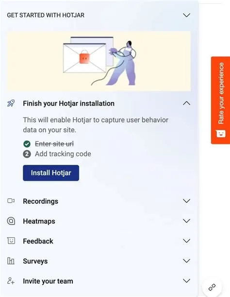
You can create a list of important onboarding tasks in a list for a user to complete as part of in-app guidance to encourage users to learn and master a new feature or product. Onboarding checklists offer steps a user must take to try out all of an app's key features.
For example, new users of Hotjar are welcomed with an onboarding checklist. It’s opt-in, with a click of a button at the bottom of the page - that way it doesn’t interrupt the user as they’re getting started.

4. Interactive walkthroughs
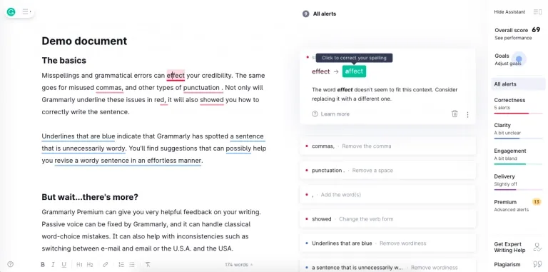
After reading a tooltip or following a product tour, users can practice what they’ve learned with an interactive walkthrough to understand it better. Getting hands-on with the product is critical, as many people learn better by doing. By having to click certain buttons or provide input, it’s more interactive than passively watching a video or clicking through a series of tooltips. Encouraging a user to use the product creates a great user experience for them when they're most motivated.
Grammarly is an excellent example of this. New users are shown a demo document after signing up and installing their Chrome extension. This document deliberately has many typos and errors that you must fix, supported by in-app guidance that explains how to do so. It's a nice way to encourage activation and results in users who are ready to begin using the product right away.

5. Hotspots
Also known as alerts or beacons, Hotspots can help notify people via the use of a colored dot or glowing element on or near a piece of functionality you want to highlight. They’re instrumental when a user didn’t use a feature yet, after errors occur, or when a new feature becomes available.
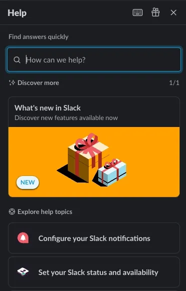
6. In-app Help
Another form of in-app guidance is a help widget that provides access to a product’s help docs from within the product itself. Slack utilizes this feature with a help tab that appears on click that lets you search for topics and read help articles without leaving the app, making it easy for users to follow the guidance and not interrupt their experience.

Tips to Nail In-app Guidance
Just using a product tour, or checklist won’t deliver a great onboarding experience. Here are some tips to create an effective experience that moves the needle.
Get straight to the point
Creating an in-app walkthrough for a complex product can be challenging. You want to split up key tasks so that each checklist has 5-7 steps at most. Using a progress bar is great to signal how far they’ve come and what’s left to do.
Personalize the experience
A personalized experience really helps. You can, of course, address the user by name, but there are all sorts of other metadata that you can use to influence an experience so it’s relevant to each user or user segment - it could be the plan they’re subscribed to, the page they’re on, prior actions performed, or even time of day.
Make it interactive
Learning by doing helps to solidify a user’s learning and ensure they’re being exposed to real value as they’re being educated about your app.
Stay on-brand
Every interaction with a brand forms the user’s opinion of you, and onboarding is a crucial example of that. From tone to visuals, in-app guidance should help create the impression you want users to come away with about your product.
Track and iterate
You’re never truly done with onboarding. There’s always another way to reduce user friction, to better understand user intent, apply onboarding best practices, or otherwise improve a UX flow. Whatever it is, though, data can help. Make sure to instrument tracking within your in-app guidance so that you can review the results and iteratively improve the experience over time.
Go beyond the app
In-app guidance is useful, but don’t forget to follow up beyond the app, such as with video tutorials, webinars, or an effective email drip campaign.
Why care about in-app guidance?
When done well, in-app guidance can have a number of benefits for you and your business. Perhaps most importantly, for both you and the user, is reduced time-to-value. We know that when a user experiences an aha moment, they’re at their most motivated - they’ve just realized how your product has helped them to solve their problem. You want to capitalize on this, and with in-app guidance, you can help users to reach that aha moment faster, so users realize your product's full potential earlier in their journey, making them more likely to stick around.
Another important benefit is enhanced self-serve onboarding. If you can use in-app guidance to enable users to perform tasks or solve an issue themselves, then you’re training them that they can solve their problems themselves and don’t need your assistance. This can lead to more proactive, happier customers, which in itself is good, but it also results in fewer support tickets, too. What’s more, when users can access self-help widgets or tooltips within your app, then they often don’t need to contact support even when they do get stuck. You can reap the benefits with improved NPS scores.
Lastly, even if you have a hands-on sales-led process, product demos are really only useful for introducing users to the platform's capabilities. If you want them to learn your platform, they need to get hands-on, and in-app guidance helps them learn while doing real work.
Creating a great user onboarding experience is essential for product adoption, and a key part of that is ensuring customers see the value in and understand your product as quickly as possible. This is where in-app guidance comes in. Whatever formats you decide on, in-app guidance is a great way to make sure new and existing customers stick around longer.
