How to turn a bad product onboarding checklist into a winner
We’ve experienced bad product onboarding checklists. This time, we can create one for better user activation. Create checklists that are enjoyable and personal.

You’re at the grocery store.
You have 30 minutes to get the ingredients your housemate asked you to bring home for dinner before their growling stomach causes the mood to spiral.
You dig through your pocket, hunting for the list, and thank your lucky stars you have it.
The only problem is that you didn’t write it. Your housemate did. The same person who famously boasts about their legible handwriting has given you a list that is nearly indecipherable.
You end up spending twice as long shopping. When you can’t make out something on the list, you skip it altogether. More than once, you want to call it quits and just leave.
It’s the same when a new customer begins the onboarding experience for your product, but worse. They don’t have a vested interest in you, and you haven’t earned their trust. That means new customers don’t have patience and want to experience your value immediately.
We know the importance of product onboarding checklists; they’re alive and well. New users want a path to follow (on their terms) that’s clear, customizable, personal, and user-friendly.
Together, we can create a better product onboarding experience. The kind users enjoy that fosters customer adoption and retention.
It’s not a selfie: What user onboarding checklists shouldn’t be
Put the phone camera down. Take a look around. Here it is: Your checklist isn’t yours.
It sounds like an oxymoron, but the truth is as clear as day.
The checklist belongs to your customers. Whether the checklist is on a desktop or mobile app, your customers seek a personalized map to experience your product value.
If you approach the checklist as your ideal to-do list, users will sense that automatically.
Although we want to introduce every feature possible and show off the app, users want to solve a particular problem as quickly as possible. Depending on the features you offer, this could mean something different for several customer segments. The key is putting the customer first. You provide personalized checklists. Customers then can experience their unique customer journey.
The checklist no longer has to be a static, rigid encounter. Instead, it can provide an intuitive, fun, and seamless onboarding experience.
It starts by understanding that your SaaS is software as a service. By putting customers first, providing support, and engaging in an ongoing dialogue to understand users, you can create better, intuitive experiences. Listen to customer feedback and use it to create better experiences.
In the product-building resource Lenny’s Newsletter, we find valuable insight in the guest issue titled “What working at Figma taught me about customer obsession.” The VP of Product Sho Kuwamoto says, “Your users don’t judge ... based on how many lines of code you write. They judge you based on how quickly you do the things that matter.”
You can develop a checklist that customers actually want. One that gets them to the one value action they desired in the first place by nurturing relationships and leveraging analytics.
Telltale signs your SaaS onboarding checklist is failing
Take a look at your checklist right now. If you’re reading this, there’s a chance it could be performing better.
In our experience at Command AI, we’ve met SaaS brands with common but costly shortcomings.
You would recognize some of the red flags:
- Low customer activation rates
- High churn rates
- Low feature activation and feature adoption rates
- Low customer retention rates
- Declining customer satisfaction
- Poor user engagement
You know the bad news, so let’s not obsess over it (like wondering who the mystery neighbor is who keeps leaving dog poop on your lawn). Instead, we can do something about it.
Changing the course of your product onboarding checklist strategy starts by identifying (and eliminating) the poor attributes causing the issues in the first place.
Characteristics of a poor onboarding checklist
The primary issue of checklists has always been the one-box-fits-all approach. At first, it seems pragmatic—you create one version and send it out into the world—but when you think about it, it makes no sense.
For example, when people walk into a supermarket, they aren’t all walking in a straight line. Some go left, and others turn right. One is speed-walking with a specific checklist item in sight, while another wanders the store and touches five things first before making a choice. If the store forced one experience over another, it would alienate a considerable chunk of its target market.
Generic checklists are the death of B2B SaaS onboarding experiences. They create a frustrating, boring onboarding experience that loses new users faster than a grocery store loses customers who are struggling to drive carts with bad wheels.
When someone signs up for your app, they want something specific. A general checklist ignores that reality and assumes everything is the same.

Secondly, checklists are often complicated and take too long to complete.
If you ever play video games, you know exactly what that feels like. Imagine your friend texts you about a multiplayer game and wants you to join them and another friend. You get on but then realize that the game requires you to go through an obligatory 15-minute tutorial process to even play with others. You would call it quits because the other players would be done playing by the time you finished the tutorial. The game is out of touch with what you want (and how much you want), and therefore loses a new user.
These drawn-out, confusing onboarding experiences do the opposite of what you want. Instead of showing customers how your product can add value, you chase them away.
Finally, another common pitfall is introducing advanced features immediately.
We get it. You’ve created so many great features, and you want to tell the world all about them. You have a right to be excited about them, especially if they improve customers’ lives. But there’s a time and place for it.
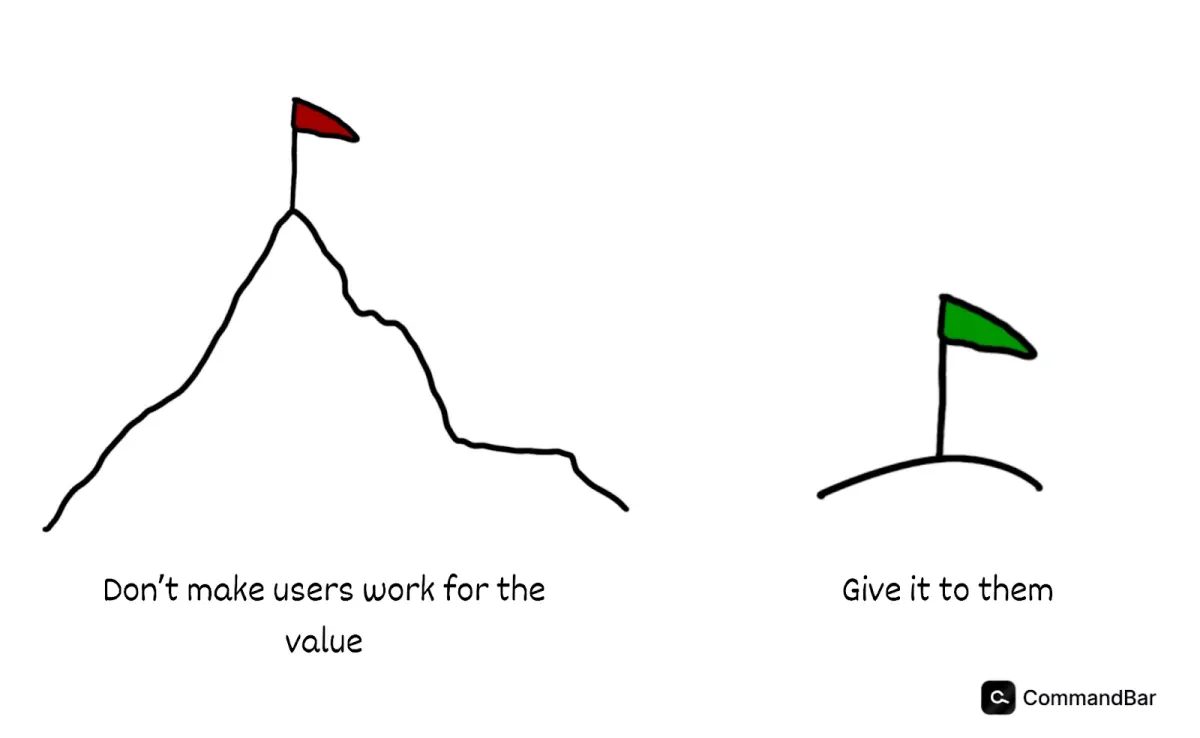
Your one goal for the user onboarding checklist is to activate the customer.
The time-to-value needs to be as short as possible to win users over and encourage them to continue the adoption process.
If you introduce a dozen different features, you will hinder the customer’s journey to solving their core need.
Fortunately, we can eliminate these common issues and replace them with product checklists that work.
Characteristics of an excellent onboarding experience
To switch the narrative of your checklist experience, we need to recognize the need for a personalized, user-friendly, timely experience.
Product onboarding checklists should be customized for each user type. Your product has different target audiences from different backgrounds, and each has varying needs. Carving out each user’s unique journey is critical as you identify these ideal customer profiles.
The good news is that it doesn’t have to be complicated. Implementing a customized experience can be as simple as asking the user directly. It’s the best, most accurate way to know why the customer wants to try your product.
You can ask the customer a few quick questions about why they need your app. Then, using an onboarding tool like Command AI, you can start that user on their unique journey.
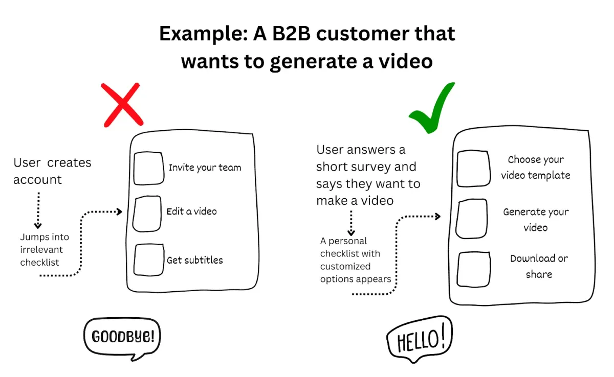
For example, if a user wants to make a video with your product, they shouldn’t get a checklist showing them how to post digital files on social media or collaborate with their team. Instead, you should show them how to generate a video in three minutes.
That one minor but hyper-focused adjustment will be the difference between a successful customer experience and an ineffective, mediocre one.

Secondly, the checklist should be easy to view and use. The experience should feel intuitive. Even though the customer is trying your product for the first time, it should feel familiar and natural.
Your onboarding interface should be clear, welcoming, and straightforward. The UX writing should be concise and relevant. The checklist should avoid distracting popups while the customer tries to follow the onboarding journey.
You can use nudges instead, which is a gentle way to point users in the right direction. Additionally, you can add multiple options for users to explore differently. If the user doesn’t want to watch a video during the journey, that’s OK. They can skip it and read a helpful resource instead.
Including a progress bar or a list outline is also a great idea. It adds transparency. The customer knows how long the onboarding process will take, and it also adds a dash of gamification, encouraging the user to complete the list.
Finally, the features should be introduced at the right time. Users should be onboarded with the key features they need now. Once they begin to explore the app, you can introduce new options and features to enrich their experience.
The key to feature activation is to onboard the customer gradually. They shouldn’t feel forced to try each tool. Instead, you present a solution at the point they need it.
In our video example, the user would learn to generate a high-quality AI video in seconds. After they get the link and download it, you can then invite them to learn how to automatically share it on multiple social media platforms. In this case, the checklist is relevant, and the user finds it useful instead of frustrating and annoying.

Ingredients, check. The recipe...? Implementing a checklist
We’ve added everything to the soup, and now it’s time to stir the pot. Setting the stage for a new, more interactive checklist is crucial.
Don’t be afraid to talk to your customers. We mentioned customer onboarding surveys, but it doesn’t have to stop there.
You can communicate with your sales team to hear common questions. Also, you can connect with your customer service representatives to find out common frustrations and questions your customers have.
Once you’ve taken advantage of the information you already have, you can reach out to some of your super users. Find out what they love about your app, why they chose you, and what they think you could do better. You can also ask new users what their onboarding experience was like.
This first-party data is extremely valuable in shaping the thought process of your customers and how they perceive your product and its features. You can use this information to improve onboarding and influence future product improvements. It also helps identify motivation gaps in your SaaS onboarding checklists.
Uncover a feature new users are attracted to because of an indirect solution you didn’t think about, like how someone might type a word in a search bar not because they want to search the term but because they want the engine to autocorrect the spelling quickly.
You can create unique checklists once you’ve talked to customers and researched their needs. It’s a good idea to have a checklist for each onboarding journey and need (keep reading on how to do that). These personal experiences create a more effective user onboarding process, and companies are more likely to increase user activation.
Afterward, choose the right software to implement the checklists and provide in-depth data and insights into customer behavior.
Creating each unique product onboarding checklist

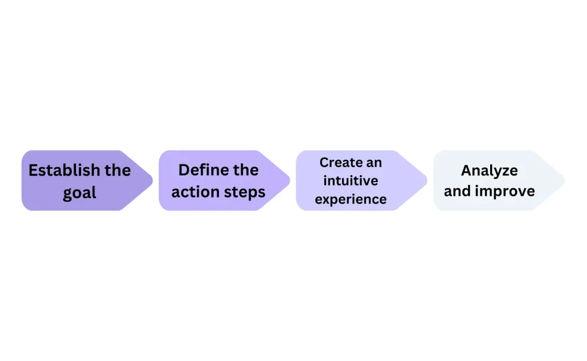
As you create a more interactive and customized onboarding app checklist, use the following steps to create the optimal experience and guide users:
1. Establish the goal
Each core feature you have represents a different customer motivation. Use your buyer personas, user analytics, and each onboarding survey to determine customers’ various goals.
These goals will each help shape your user onboarding checklists. The onboarding experience should focus on the goal and results. Avoid straying away or distracting users’ onboarding flow with steps or features that don’t meet the specific use case they have in mind.
After the customer accomplishes their goal, you have the opportunity to present another feature that directly responds to their original use case. For example, if it generates analytic reports, you can invite them to learn how to share them with their team.
2. Lay out each action
Once you have a goal, map out the action steps. They should be clear and concise. The shorter the number of steps to reach the goal, the better.
Onboarding tasks should have multiple customizable options. For example, users might be able to skip an option if they already know how to do it. Or, they can learn more about a particular task if they want to dive deeper.
3. Make it feel natural
Checklists shouldn’t be frustrating or involve a big learning curve. Instead, they should satisfy user behavior. The checklists should be straightforward, involve multiple visual illustrations and media uses, and offer an enjoyable experience.
In other words, the checklist should be easy to follow—it shouldn’t be a chore. In fact, the product checklist should help users quickly learn how to use the product and get them even more excited about its potential for their needs.
4. Analyze and iterate
Once you’ve launched your product checklist, use the right onboarding software to analyze new-customer behavior. Learn from the data and adjust your checklists to accommodate users better and increase customer satisfaction.
Providing additional support
Product onboarding checklists are a great way to get to the “aha” moment and activate new users.
However, these interactive checklists should be viewed as a springboard.
Once you have introduced customers to relevant features, your onboarding platform should also help you provide additional resources for the customer experience.
At the end of the checklist, you can recommend a help hub or resource center for customers to learn more. You can also implement a 24/7 AI assistant and universal search experience that can help users leverage your platform’s full power.
An innovative checklist, combined with cutting-edge onboarding features, creates a solid customer adoption path that reinforces your app’s value and grows your business.
Adding in-app checklists to your software
Crafting your checklists and designing your strategy is only half the battle. The other half is finding a solution to execute the user-flow checklist and offer a native onboarding experience.
Companies should choose a partner that offers user-friendly, customized personal journeys and the analytics and dashboards needed to improve retention, customer lifetime value, and customer loyalty.
The right onboarding platform elevates the customer experience from the new-user stage to every moment you introduce an exciting new feature.
As you choose an onboarding partner, make sure they follow the principles of modern, effective checklists. They shouldn’t go for the dead checklists of the past, where generalizations and poor results reign supreme. Product onboarding checklists should embrace unique customer journeys and give your users complete control over their experience.
Unlocking the power of personalized product onboarding checklists
The checklists of today and the future provide one of the best ways to transform new users into loyal customers.
By providing intuitive checklist experiences, like how Command AI creates a fun list with multiple options to learn a new feature, businesses can increase customer adoption and retention and scale their platform.
Today, we live in an exciting time for onboarding. We can leverage interactive checklists, AI, universal searches, and personalized journeys to win one customer at a time—at scale.
