Turn new users into product evangelists with innovative onboarding tools
Innovative onboarding tools don’t have to be boring and frustrating. They can increase product adoption and turn new users into brand advocates. Learn how.
Even if you don’t drive a Tesla, you know someone who does.
They can’t stop talking about it. They love it, defend it, and spread the message of the Tesla brand everywhere they go.
As business leaders, isn’t that what we all want for our products?
It’s one thing for a user to enjoy your platform (we all love customer retention). But that doesn’t mean they will spread the word—leaving a lot on the table.
We need onboarding tools to guide users through product adoption successfully. But the right onboarding solution also has the potential to get users so excited about your product that they become ambassadors.
Think back to your favorite high school teacher, and how they made a positive impression on you and helped you remember the Pythagorean theorem. They made things interesting, met your needs, and guided you along the way.
Platforms like Command AI create enjoyable (and more effective) experiences using this user behavior philosophy.
In our guide, we’ll share what we’ve learned so you can replicate better customer onboarding and strategy results. No geometry required.
Rethinking the onboarding process (so users don’t hate it anymore)
Imagine the traditional onboarding program:
- Someone signs up for your app
- They see a pop-up that gives them an overview of your SaaS
- They get a tour and need to complete each step
- As they progress, there are more pop-ups and brief tangents that highlight key features
- Finally, they finish onboarding and can start using the app
The traditional method feels a lot like the classroom with an uninterested teacher. The subject might be interesting at first, but eventually, you have no idea what the instructor is talking about. Like onboarding, you give up before even trying.
Old onboarding looks straightforward on paper, but it’s far from the truth.
Here’s what’s really happening:
- The user wants to get started right away, but the introduction screen gives no alternative options to skip or explore another aspect of the product
- They have to drudge along a full tour with confusing concepts (hello, learning curve ✋)
- New customers deal with annoying and frustrating popups
- When they finish, they can’t remember what they wanted to explore at the start, and don’t feel like tinkering with the app further
- If they decide to keep going, they’re feeling turned around and on their own, with little to no resources (lacking an interactive knowledge base)
Both of these processes describe the same experience. The difference? It’s coming from two different perspectives. The key is rethinking onboarding, not from your perspective, like our math teacher reclining on his desk with his legs up, but from the students’—your new users.
Elements of an engaging onboarding experience: x+y=z
The only way to conquer something, like algebra in middle school, is by learning to appreciate it. If you want to master it, you learn to love it.
Great onboarding strategies close the learning gap, get users to the “aha” moment as soon as possible, and make the process enjoyable and exciting. This in turn, helps create brand advocates to grow your platform.
We need vital inputs to execute a better strategy.
Product tours need a makeover. They shouldn’t feel like a forced exercise (like that one coach who didn’t like you and made you do all those extra push-ups). It should be enjoyable.
Instead of relentless, frustrating notifications, users can enjoy an interactive tour. The experience includes nudges that softly appear in critical locations, encouraging users to explore and try new features.
Through onboarding checklists, users can follow a roadmap at their own pace to try your app and self-guide themselves to the finish line.
User onboarding platforms can include AI assistants, like Copilot, that use all your documentation and website pages to offer automatic, 24/7 help to users. You can also add a place for resources (or knowledge hub), like the HelpHub, so new customers can dig deeper.
If a user wants to voice frustration or communicate with your team, your onboarding tool can also have an easily accessible place for in-app feedback and customer support.
These foundational components for an onboarding strategy will get you started in creating a better, more engaging experience.
Most of the time, it’s not about innovative design. Strange and different experiences can alienate new users. Instead, it should be familiar and so natural that it feels like they’ve known how to use your app all along.=
Great onboarding tools can implement intuitive experiences for a better onboarding process.
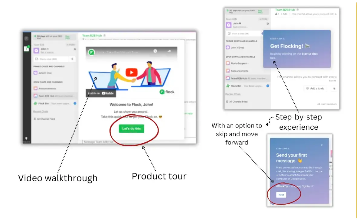
Example: Flock creates multiple onboarding paths
lock, the team collaboration tool, creates a diverse range of onboarding experiences based on user behavior and intuitive design.
When a new user starts an account, they fill out important details. They can choose the type of team chat or department they want to focus in.
When they arrive at the app, the user can watch a video walkthrough. Or, they can get started on a step-by-step product tour.
If the user starts the tour and doesn’t want to try a specific step, that’s all right. Flock allows users to click “next” and skip that step while still continuing the journey.
Each step creates feature-focused use cases.
It’s through this experience, along with other user options, that Flock can meet new customer needs.
Customizing journeys for different user types (no more boredom)
Back to the classroom. Your middle school teacher is teaching you how to calculate your apple deficit.
And you’re in the back row thinking, “When will I ever use this formula to find out how many green apples Johnny is missing?”
Meanwhile, your classmate in the front row is having a blast answering theoretical questions.
You are both having different experiences with this lesson. But you’re in one classroom with one teacher.
Your product might be teaching one concept, but different users will require a different experience to understand it.
That’s why analyzing your ideal customer profiles and their user behaviors is essential.
You need to use your onboarding tool to gather the data and study your metrics for a better customer understanding.
But we can anticipate a general idea of who we are dealing with.
Some people want to jump in, fall, and scratch their knees on the asphalt—figuring it out on their own.
Others need a clear, organized road to success.
Some may prefer watching videos, while others want to read each step.
These are all unique self-service customer journeys that need to be satisfied. If you are excellent at onboarding only one type of user, you’ll limit your ability to scale your product for more user types, even if they’re all looking for the same features. That’s not a sustainable strategy for growth.
These types of behavior can be analyzed by the following trackable actions:
- In-app clicks or movements
- Navigation patterns with heat maps
- Tracking through onboarding tours and features
- Activation completion rate
Example: Users that prefer exploration
If you notice a specific customer segment leaving your app before activation, you can dive into and assess that behavior.
You can study when most of those users abandoned the onboarding and which feature they were using. If it was during a step-by-step process, they may want a more free-roaming onboarding experience. Perhaps you already offer it, but the users failed to use the feature.
Brands can add an option during the onboarding walkthrough to explore and try a specific use case. Through nudges and tooltips, these users can onboard the way they prefer—through a personalized, guided experience.
But these kinds of insights can’t happen without the tracking from your onboarding tool, along with in-app and follow-up feedback surveys.
The SaaS platform BambooHR gives new users options before they start their free trial.
Users can follow the traditional onboarding process, they can watch a video to get briefed on the platform, or they can schedule a personalized tour.
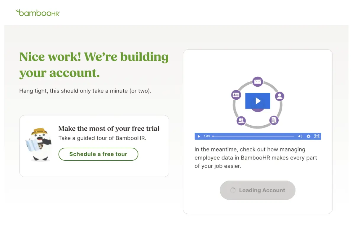
Onboarding tools will help you meet different product adoption journey needs. Like the example above, users should have options, including skipping topics and choosing an alternative like “watch the video.”
You can implement these strategies and then some. For example, for those who like to jump in, nudges can help them explore. If they get stuck, an AI assistant is there to help.
The key is creating an ecosystem of different yet harmonized paths to reach the end goal.
Getting down to the nitty-gritty: Measuring success in onboarding
What defines successful onboarding? It may include different metrics like your activation rate, adoption rate, retention rate, and churn rate.
You also want to ensure your time-to-value (TTV) is as short as possible. If your user activation is quick and customers see your value immediately, you’ll likely see consistent usage and better retention.
That’s part of it—but it isn’t the long-term goal. Onboarding shouldn’t end here, with short-term usage and behavior metrics.
We don’t want to win customers so that they use our app for a time period. We want to increase the customer lifecycle and create lifetime ambassadors for the brand to increase reach.
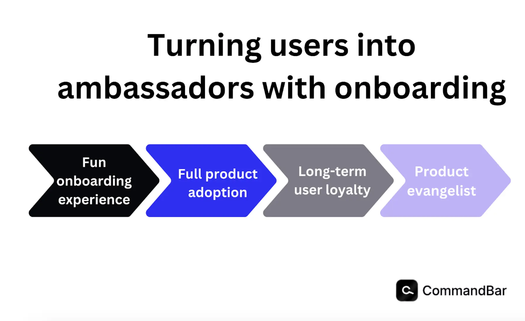
In addition to customizing journeys for users, you need to choose the right onboarding tool in the first place that accomplishes the long-term goal of fostering brand advocates.
The real evidence of your success is found in your retention rate (and usage rate), and how passionate your loyal customers are. If they openly adore your brand like a Tesla owner, you’re in good shape.
When customers feel understood throughout an enjoyable onboarding experience, they have a positive experience with your platform. You can continue to nurture that experience by communicating with users, offering updates and new features, and nurturing community engagement opportunities.
If you can nail your first impression through onboarding and sustain it, you are well on track.
Choosing the right onboarding tools that create passionate users
In The State of Customer Onboarding (2023) report by Rocketlane, 60% of respondents reported that insights and patterns for onboarding needs to be improved. Additionally, 59% believe they need to improve how feedback can be captured.
Brands shouldn’t have to juggle different onboarding tools for several customers and segments. Nor should they have to utilize a bunch of different analytic platforms.
Companies should be able to use an onboarding tool that can integrate all your needs by incorporating multi-journey onboarding experiences with the data to inform your strategies.
The right tool should offer self-service capabilities with one-on-one support and personalized experiences.
Continuous improvement: The onboarding feedback loop
As you build your activation and adoption experience, your onboarding tool should collect user behavior information and gather user feedback.
As mentioned earlier, in-app feedback is a great way to start. But you can also use metrics like a net promoter score (NPS), in which you send out surveys and determine how likely someone would recommend your app.
Not only does this help identify your ambassadors so you can nurture them, but it also helps you hone in on those who have yet to fully believe in your brand value. The more passionate users you can develop, the better your reputation.
Create a tight feedback loop to gather relevant information and feedback and quickly implement adjustments. You can measure those changes and continuously tweak your strategy with the right onboarding tool.
What does onboarding success look like?
One great example of onboarding engagement experiences is Zapier, a no-code customizable business automation tool. The tool facilitates numerous integrations, from CRMs like Salesforce and HubSpot to marketing and project management tools like Mailchimp and Airtable—all with user-friendly functionality.
First, Zapier gives you a roadmap of the onboarding flow so you aren’t starting in the dark. Then, it asks you how you plan to use the app.
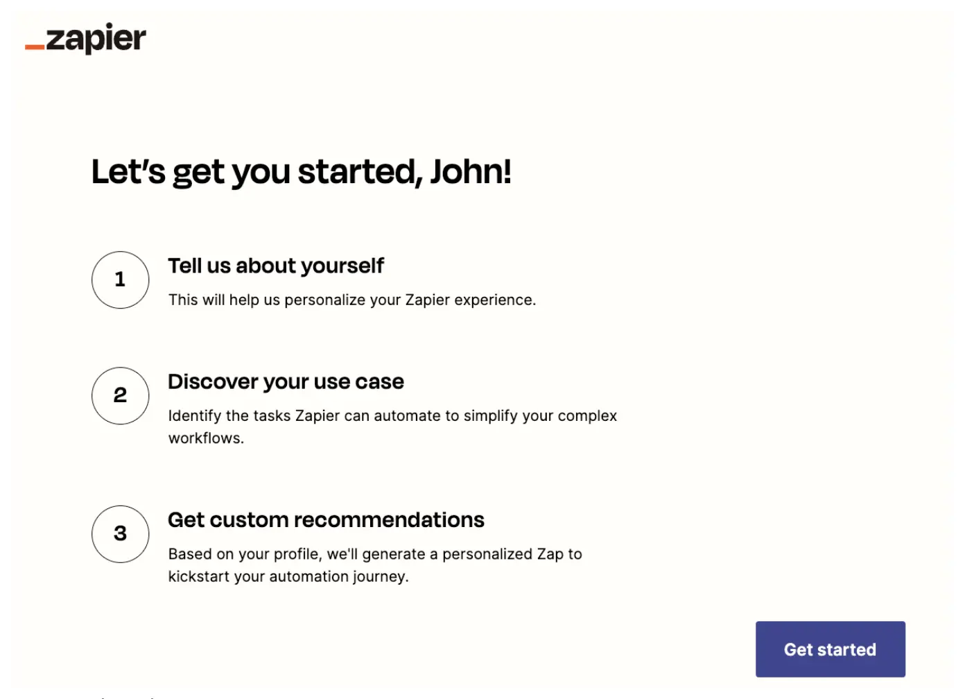
The short questionnaire is precise, so it can help you produce the perfect personal use case.
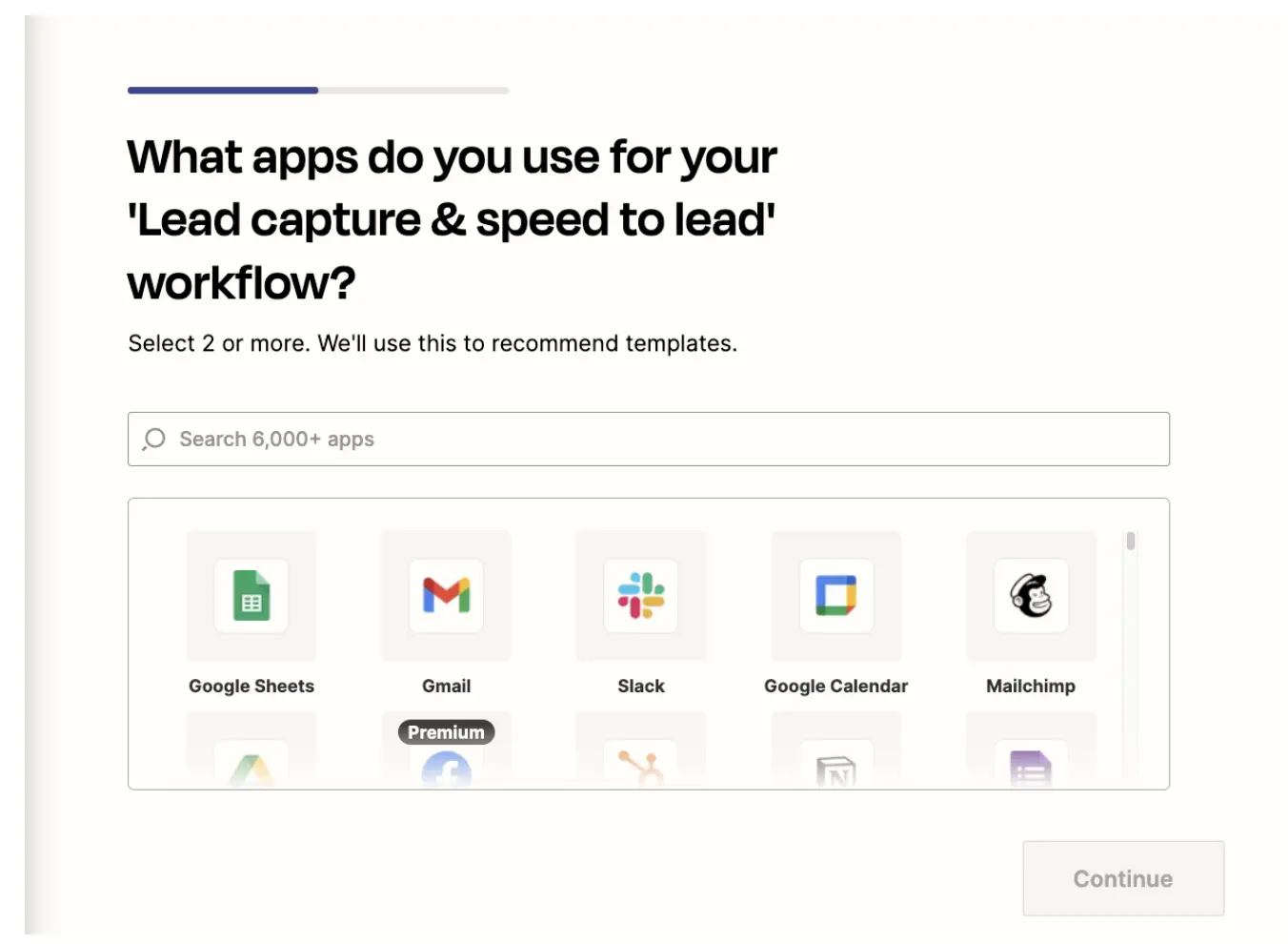
Once you pick your first two apps to automate your business, Zapier offers a suggestion so you can test an action.
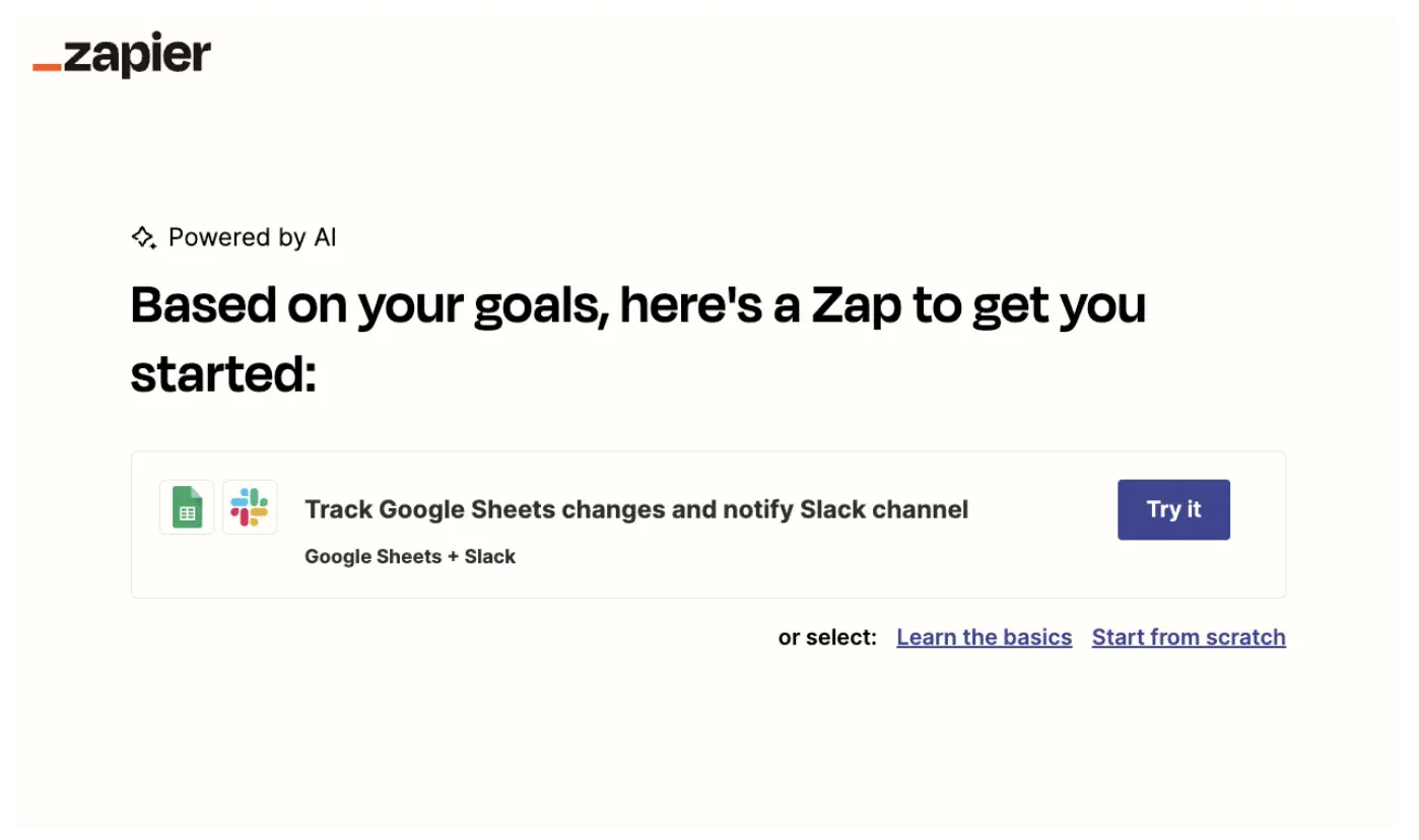
In this example (shown in the image above), Zapier suggests we automate Google Sheets by tracking changes and notifying our team in a Slack channel.
When the user tests the automation and sees immediate results, Zapier activates the customer. Users see the value of its product in real-time.
Zapier’s onboarding is an excellent example of simple, clear, and effective onboarding and customer activation.
What’s notable about this onboarding approach is that customers get a use case that is 100% applicable to their needs. If users start an account thinking of a particular automation they need, they can get it running in just a few minutes.
User onboarding tools to streamline success (so everyone’s happy)
You can apply similar strategies for your platform with a robust onboarding software solution. It can offer fun user experiences and walkthroughs while catering to numerous customer behaviors on day one.
Businesses can help users with all styles of learning and onboarding preferences get started on their app immediately. Users can even dig deeper with AI assistance like Command AI. They can chat 24/7 and get the answers (and in-depth documentation) they need.
Once you create an onboarding experience that’s enjoyable, clear, and effective, you can improve your customer experience and scale for growth as new users spread the word.
