How to run painted door tests that don't piss off your users

You've probably launched features you thought might catapult your career forward. After feverish work towards launch day, it's finally there: Emails go out, social posts go live, Slack channels are buzzing... but users aren't. The feature is a flop.
This happens to every product person at some point. And the inevitable debrief meeting always uncovers the same lesson:
"Next time, we'll figure out if users want this before we build it."
That’s great! The worst mistake you can make is to chase new features in a blind quest for feature parity or simply because something is sexy.
However, it can be tough to collect this data. User research can be costly and time intensive, and your internal teams are unsure of what direction to take.
What’s a PM to do?
Enter the painted door (don’t hit your head)
A painted door test can be an extremely cost effective way to gauge market interest in a new idea without fully committing your team’s resources. This research strategy, also known as fake door testing, is key to validating product ideas, refining pricing strategies, and getting user feedback, all while minimizing the risks associated with full-scale development and user research.
With this fake painted door test you can collect highly relevant data with a simple experiment that provides actionable insight quickly.
But be careful: a poorly executed fake door test can really piss off your users and lose a lot of good faith.
Your users hitting a poorly executed painted door test
(Video Source)How to execute a painted door test without pissing people off
So, let’s not piss your users off. Here’s how you can successfully run a painted door test to save your org time and resources without major user headaches:
- Craft an engaging CTA and landing page for your proposed feature.
- Add the CTA into your product as an enticing feature highlight or nudge.
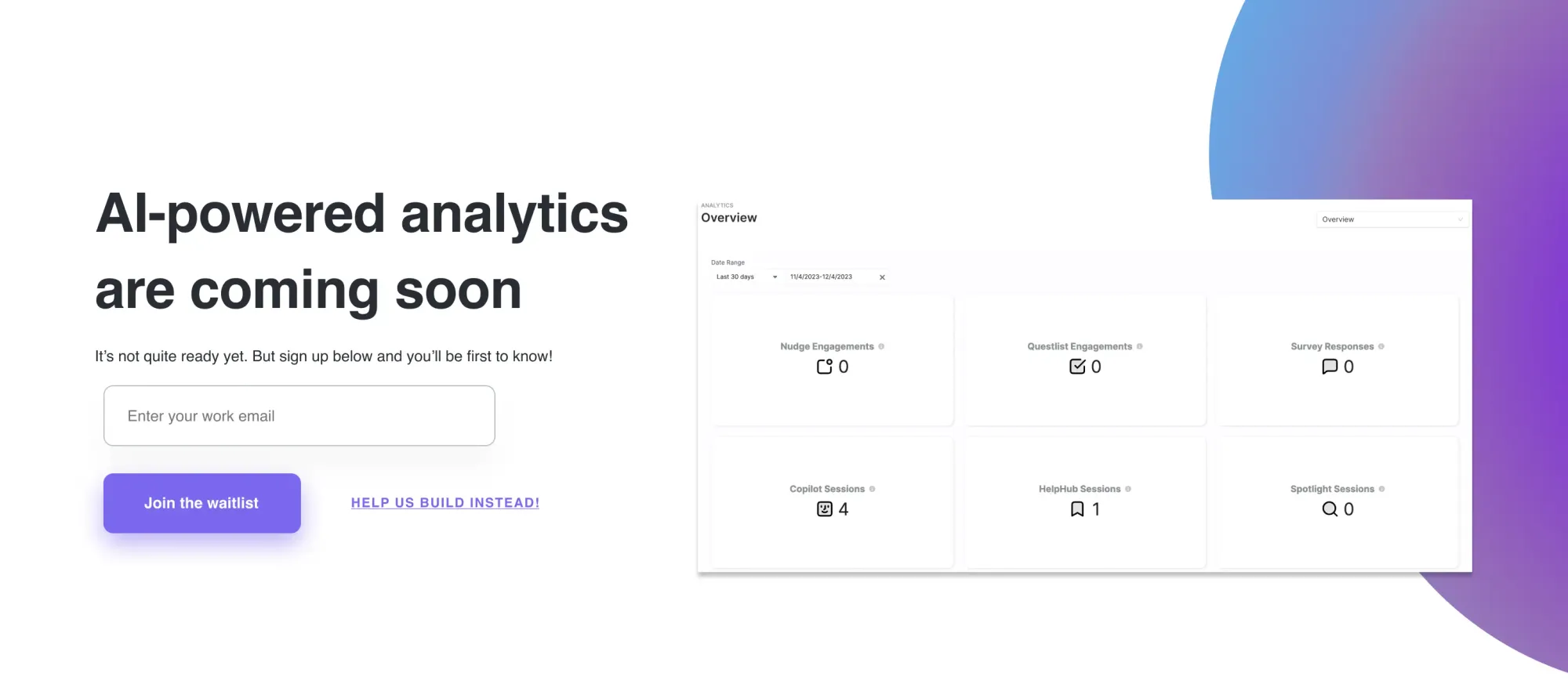
- Curious users click, only to hit the landing page to find a message explaining that while it’s still in the pipeline and not yet ready, their input would be very valuable!
- You collect quantitative data on user engagement, like CTR and time on page to measure interest and demand. Plus, you can add a survey on that landing page to ask for additional qualitative feedback and input (we’ll show you how to do that 😉 easily!)
Let’s dive into each step in a bit more detail, and review some best practices.
Building an fake feature highlight CTA— a real risk (and opportunity)
As a PM, you know how important it is to balance product testing and development needs with your respect and relationship with your users. To that end, it's very important to ensure that in creating this hypothetical feature and positioning it in your product, you are taking a risk.
So, when you create a highlight or nudge for this imaginary feature, you need to make sure that while it's appealing, it doesn't over promise or create frustration.
Put yourself in your users shoes, and imagine how they might react to that spark of excitement at the Highlight announcement, only to find the features not ready yet.
How do you reduce frustration?
How do you avoid anger?
The key is in your messaging approach.
It’s best to use language like:
- Learn more
- Explore
- Get early access
Here's how to build this CTA in under a minute with no code in Command AI:
This positions it more softly with an element of excitement & discovery, without over promising.
Avoid language that over promises or is hard and fast, like:
- Try now
- Check it out
- Sign-up
Building your landing page to maximize feedback and minimize frustration
Keep your landing page clean and to the point. If you play games, users will sniff it from a mile away and get pissed off.

Here’s some messaging angles and tactics to use on the painted door door landing page:
- Acknowledge or apologize for the feature not being quite ready
- “We’re so excited to bring this to you soon, but it's not quite ready!”
- “We're working hard on this, and can't wait to bring it to you!”
- Thank them and ask for feedback
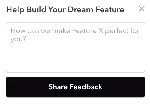
- “We’re stoked to see your interest! How could we make this feature amazing for you?
- “Thanks so much for your interest! How could we make this new future perfect for your workflow?”
- If you want to create a waitlist or pool of beta testers, you can add a collection nudge:
- “interested in getting Early Access? Leave your email below and we'll message you as soon as it's ready!”
- “want to help build with us? Add your email and we'll invite you to connect and collaborate with our team!”
Here's how that collection nudge can be designed easily in CB:
A final version could also look like:

Segmentation
One of the most important considerations in building your painted door test is how you will segment and structure your test audience.
There's certainly a small handful of cases in which running a painted door for your entire user base could make sense, but most of the time that is not the case.
Generally, you'll want to start small and be very targeted. You want to understand the maximum amount of information with the least disruption to the smallest amount of users.
To begin, you should clearly identify and articulate your goals for the painted door test.
- Why are we running this?
- What is our objective?
- What data do we need to collect?
- What user groups does this affect?
After you list out all of these questions you'll begin to get a sense of what segmentation might make sense for your painted door test. You can take these answers and formulate them into a specific segmentation strategy.
Lifecycle
For example, you could break up folks based on their stage of engagement with your product, be they new users, veterans, or somewhere in between.
Technology / Platform
Or, you could segment it based on the technology they're interacting with your product on, for example mobile versus desktop.
Function
You might also segment these users across different groups or functions, like sales versus marketing versus customer support versus HR versus operations.
You get the point!
Essentially, you'll want to craft a segmentation strategy that best captures your target audience, without exposing relevant folks to the painted door test.
For example, it probably doesn't make much sense to show brand new users painted door tests that are for improvements to a specific feature, because they're barely familiar with the feature in general at all!
Structuring your test group messaging
Once you've segmented your user base into the test groups, if you have multiple test groups it can be wise to change and curate your messaging. For example, if you're testing a new AI powered generative tool for your product, and you want it to hit all of your product users regardless of their role, you still might want to segment the messaging.
The use case you highlight in a CTA for an executive will be very different from that of an SDR.
Pricing potential
You can take this one step further by adding hypothetical pricing to your painted door landing page. In this scenario, you not only simulate the offering but simulate the pricing.
You could offer three different tiers, and using the CTR onto each of the pricing tiers, you could gain more understanding of what customers might anticipate or expect as a fair market price for this service.
Be careful with this added layer, as when you eventually hit them with the messaging that the feature is not available, they may be more frustrated if they've gotten their hopes up and started to think about the purchasing decision, leading to bad blood.
Data
There's a variety of data points that are important to assess when looking at your painted door data, but perhaps none is more important than your click-through rate.
Click-through rate (CTR)
That's because we are ultimately trying to gauge user interest in this potential feature, and nothing gets closer to capturing that than the percentage of users who are presented with a nudge towards the proposed feature who actually click on it.
CTR is precisely the metric you want to see to gauge what percentage of your users are intrigued by this feature.
Conversion rate
You also want to measure the actual conversion of users for an action on your landing page. Let's say they hit the landing page and are presented with a waitlist sign up input, or a beta feature testing application.
You'll want to see what percent of people actually commit in some way, whether it's an email or a phone number or another method for notification.
It'll obviously be helpful to view both your click-through rate and conversion rate across the different segments you've identified. That way, you can understand which cohorts are most interested in the product, and which ones have little interest. This will allow you to tailor your future product development to those more interested groups.
Other quantitative data
You can also look at more generic and less direct data like bounce rate or time on page to understand how people are reacting to the offering.
Qualitative feedback
Plus, if you've added a surveyor feedback element to the landing page, be sure to incorporate that qualitative natural language feedback into your analytics and product decision making. In fact, some of these nuggets or suggestions are frustrations which could be some of the most salient ones.
Painted door testing metric benchmarks
The one final piece of the puzzle here is that you might not have a sense of the expected click-through rate or conversion rate for a pain in door test. There's no established industry benchmarks, mainly because each painted door test can be so different from another.
CTR benchmarks
That said, I would definitely recommend that you track your painted door tests over the years and begin to identify high, average, and low performing ones through CTR and conversion %. That way, you can develop a sense of what success looks like at your company for a painted door test, and therefore prioritize the projects that achieve those numbers.
Conversion benchmarks
Another helpful framework for your conversion is to look at your existing feature adoption, and then compare that to your painted door test.
So for example, if you see 20% of MAU using Feature X and you think Feature Y that you ran the test for has a similar use case frequency and value, you’d probably want to see something like a 10-20% conversion to go after it.
Turning painted door insights into better product decisions
Harnessing insights from a painted door test is not just about collecting data; it's about turning these insights into actionable strategies that shape better products. It’s pointless to run these tests if you won’t actually use your data to inform your product development vision!
How do you do that effectively, you ask?
- Prioritize Features Based on User Interest: The data you've gathered, especially the click-through and conversion rates, are not just numbers. They are clear indicators of what your users are interested in. Use this information to prioritize features in your development pipeline. This ensures that you're working on what your users actually want, not just what seems trendy or innovative.
- Refine UX/UI Based on Feedback: The qualitative feedback from your landing page survey is gold. Users might provide specific suggestions or express frustrations that can guide your UX/UI improvements. Implementing these changes not only enhances user satisfaction but also demonstrates that you value user input, fostering loyalty and trust. Communicate that you will directly use their feedback!
- Adjust Your Roadmap: The insights from your painted door test might reveal new opportunities or challenges. Maybe a feature you thought was peripheral is actually in high demand, or perhaps users are indicating a need for a feature you hadn't considered. Adapt your product roadmap accordingly. Flexibility and responsiveness to user feedback are key traits of successful product management.
- Measure and Iterate: Finally, remember that product development is an ongoing process. Use the insights from this painted door test as a starting point, but continue to measure user engagement and satisfaction. Regularly conducting surveys, analyzing user interactions, and staying agile in your approach ensures that your product remains relevant and user-centric.
How to deal with pissed off users
Listen, even if you follow all of this advice, you’ll probably still have folks who are frustrated and pissed off. They wanted this new feature, and now it is not ready for them — f***!
Well you can still gain valuable insights from these folks. How?
1 - Use deadends to gather feedback.
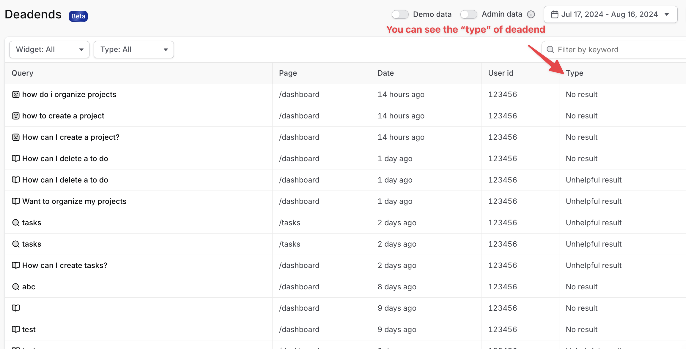
Folks hit the landing page, and failed to sign-up for the waitlist or do anything else on page. You can structure a nudge to follow up and ask them what they had hoped to experience or what they would like to see in the future.
You can also analyze deadends from queries in Copilot that relate to the painted door. If folks are asking about that painted door feature, you can see how they talk about it or what they're interested in, even if there's no help documentation for Copilot to answer with.

2 - Rage clicks
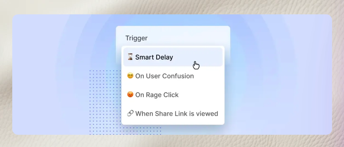
Folks hit the page and go crazy, clicking everywhere in frustration. How do you calm them down? You can use Command AI to set up a nudge to show only after rage clicks occur — the kind of smart targeting that distinguishes your product over competitors.

The smart triggers can be especially helpful for things like painted door testing because it can inherently risk frustration.
Evolving with your painted door test
The true value of a painted door test lies in your ability to interpret and act on the insights gained. By focusing on user-driven development and remaining adaptable in your strategy, you can transform these insights into a product that not only meets but exceeds user expectations. Remember, the best products are those that evolve with their users, always striving to be better, smarter, and more intuitive, based upon real user feedback and data.
