Goodbye popups, hello to better product tour software
Popups are annoying, and they’ve been around for far too long. Learn how better product tour software and UI search create an interactive user experience.

Ever been in deep focus mode at a coffee shop and had someone interrupt you? You jump, pulled in two directions, almost spilling your latte.
Sadly, product tour software often feels similar. No one likes intrusive interruptions, so why are apps still using relentless popups?
Product tour software should weave together interactive onboarding experiences, subtle engagement, and smart targeting to give users a self-guided, enjoyable, and personalized experience. After all, if you want long-term, loyal users, it shouldn’t be a chore (or a bore) to learn how to use your product to the max.
Before we dive into how we can implement a better product tour and choose the right software, let's look back at where we came from to know where the future of product tour software is headed.
Class is in session: A brief history of the evolution of product tours
Product tours have come a long way since the 1990s.
Think of the first time you used a Microsoft or Apple product. It came with a video and some direction on how to get started, but then you were on your own.
It was so new and foreign to many users that schools and universities added classes to use some of these programs.
Product tour software evolved to provide insight in real-time. You would see notifications and alerts as you click and work around the platform. That worked for a time, but many platforms, hoping to increase adoption and activation rates, turned to more aggressive solutions.
If they could place more enthusiastic popups and bold ways to direct new user behavior, perhaps that would produce better onboarding results and customer success.
The results? SaaS businesses created more frustrated users.
Sadly, not much has changed for many companies. Most product tour software is interrupt-driven. This method hurts your retention rate and long-term growth. The tools lack granular targeting capabilities like who should experience a particular tool and when.
The right platform, however, can combine classic user properties with intent to better target experiences.
Product tours and tutorials don’t have to be something users want to get out of the way. They shouldn’t be annoying, flashy, and an obstacle to using your platform.
Product tour software should be used for good (i.e., improving user experience), not for bad. Because when it’s all said and done, you want users to learn how to use your app and enjoy it, increasing the odds that they’ll stick with you for the long haul.
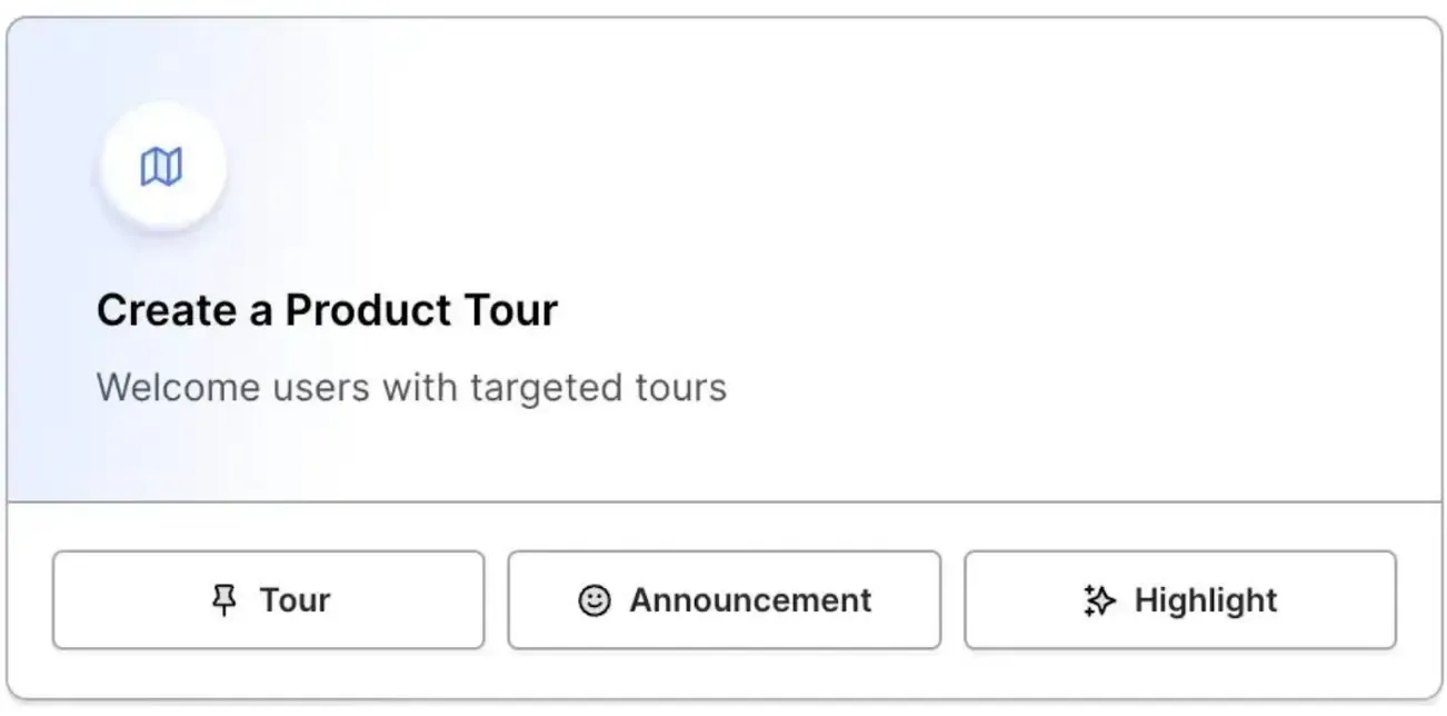
Today’s product tour solution puts the joy back into onboarding. Through interactive, focused, engaging product experiences and robust UI search tools, new customers can start using your app with little to no learning curve. It creates the experience that sparks word-of-mouth referrals and passionate brand ambassadors. (And no one has to get burned by spilled coffee.)
The one goal of a product tour
While your product tours should make room for self-guidance and interactive experience, they should also be highly focused. Your one goal should be to get users to the “aha” moment as soon as possible.
It sounds simple, but so many businesses fail to do it.
For example, imagine you want to get subtitles on a video you just recorded.
You sign up for a new platform, ready to generate the perfect content.
Instead, the tour walks you through team collaboration, sharing, editing, and all sorts of features that feel pointless to you at the time. You quit the tour and (probably) the app altogether. It took too much time and energy to even begin to figure out how to do the task that was priority numero uno.
An approach one million times better than a forced experience
What’s the better alternative? Focus on the experience and empower the user to explore the product.
To do this, you need to know why the user wants to try your product in the first place. And we’re not talking about taking your best guess based on what most people use your product for, and hoping you’re right. More often than not, the smartest starting point is just to ask users outright. Once you know the reason for using your product, you can kick start their unique journey.
Tyler Wanlass, who leads product and design at Command AI, addresses how brands can treat product tours differently using the video example:
“Knowing [the user wants to get subtitles], build a really focused onboarding tour with no more than three to five steps. And most importantly, get to the ‘aha’ moment—get to value…in this case, showing subtitles to [the] video… if you focus on just that, you don’t have to worry about anything else—not yet.”
Why not? According to Tyler, anything extra (like other features) can be shown later. By first showing the use case value, you earn the right to show off the rest. These highly-personalized tours that encourage self-guidance through focused lenses will provide a much better experience and increase customer retention for platforms.
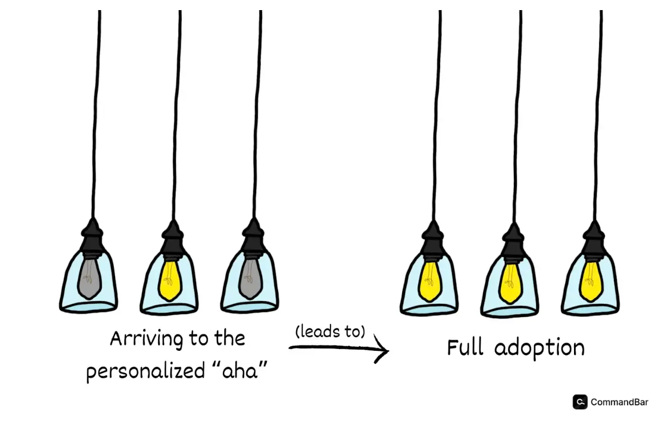
In a nutshell, your product tours should be:
- Highly-relevant: The product tour knows what the customer is trying to achieve and helps them do it immediately.
- Customizable: Users can easily snooze or return later during parts of the tour so they can refer to it when they need it.
- Enjoyable and user-friendly: The experience should feel natural and familiar.
- Focused but self-guiding: The tour should provide a unique experience that allows users to explore within their contextual needs.
The key is proving value right away through fine-grain targeting. In other words, providing all the tools users need for a personal experience.
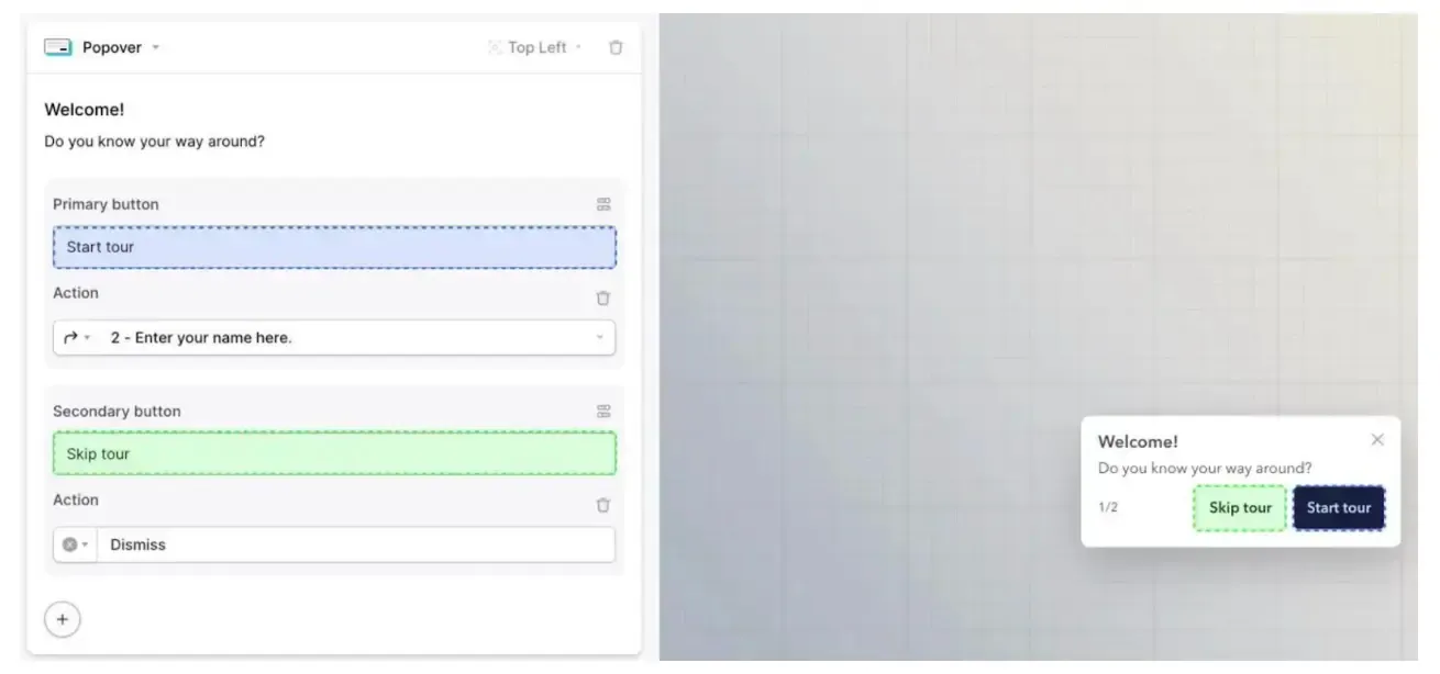
Give users the power: Integrating UI search into product tours
If you envision the product adoption process as a customer journey, then you can imagine the ideal product tour experience.
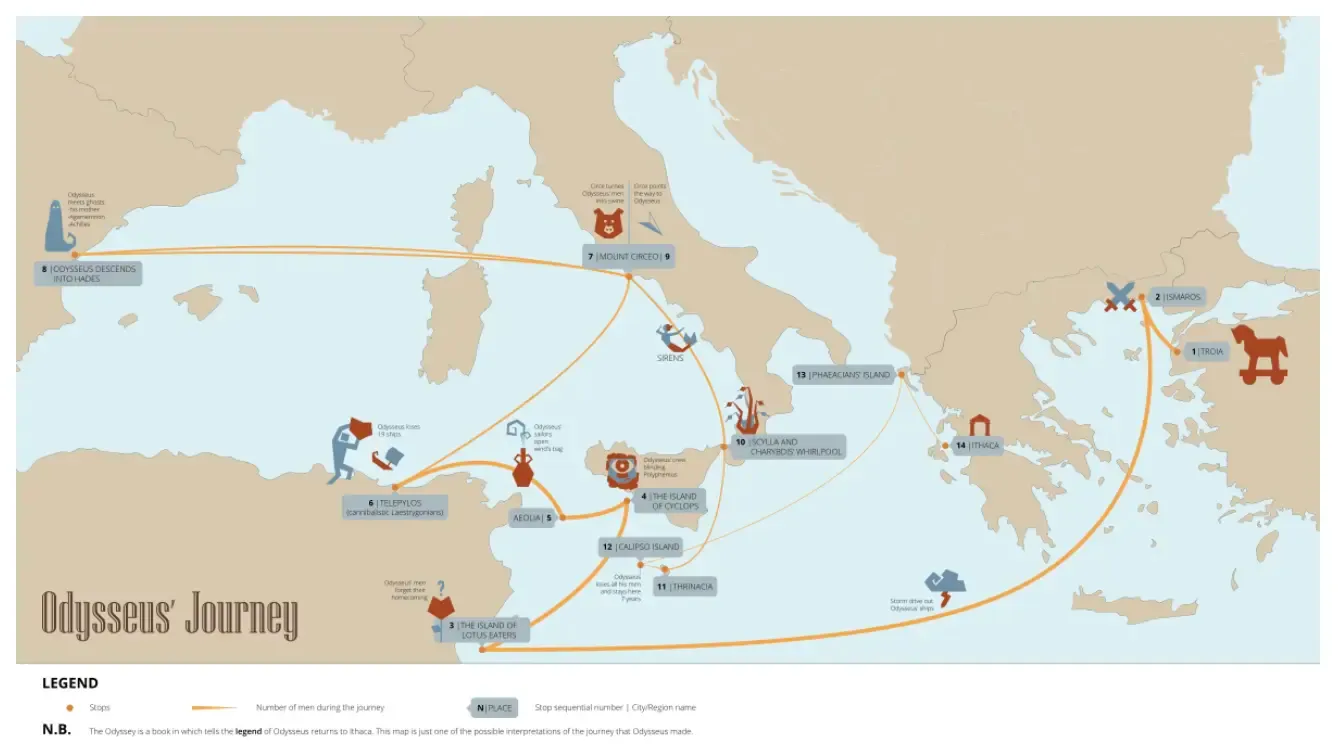
Just like a hero’s journey in The Odyssey, your customer is on a path to find an answer to their problems. They’ve likely already dealt with experiments and failures—maybe they’ve been let down by another platform. It’s our job to ensure that the product tour can meet their needs and expectations, and create a friendly experience.
You've successfully activated the customer once the user reaches the “aha” moment. Then, you can continue to earn the right to show off more of your product for customer loyalty.
Adding effective search features can add to the journey as your users get to know your product.
Like Odysseus’ journey, the customer path is often winding, led by curiosities and individual needs.
Search experiences
One way to foster a nonlinear (and human) customer journey is through a robust UI search strategy.
Your SaaS company platform can include universal search, AI chat assistant, and other new features that answer customer questions anytime.
Imagine a new user is going through your product tour experience. They have the freedom to follow checklists and nudges. But they can also explore. Using a feature like Command AI’s Universal Search, they can find the content, resources, and knowledge base needed to fulfill their needs and inquiries in seconds.
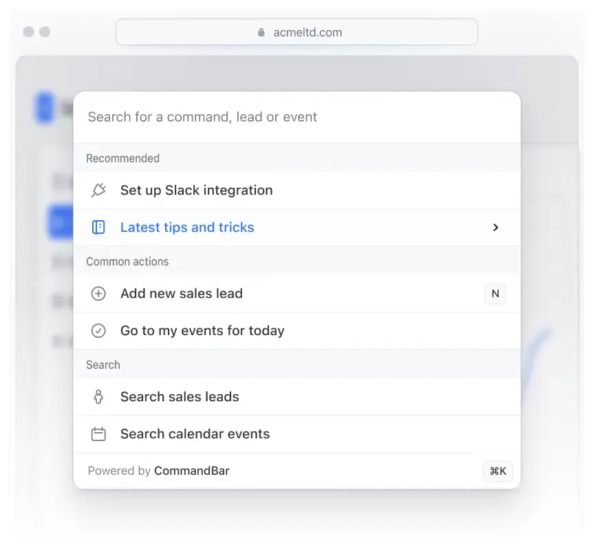
Helpful guidance
The platform can also include contextual recommendations to help point the user in the right direction and drive usage to the best, relevant key features.
Tooltips, along with nudges and checklists, impart well-placed, visible, and subtle information that increases feature adoption and encourages more usage
With an AI chat assistant—we’re pretty fond of Copilot, for example—users can ask questions and get immediate answers with additional resources to dig deeper, right from your website.
These kinds of search abilities make product walkthroughs and new user experiences interactive.
Whether a user wants to go through an onboarding checklist or wants to adventure into your app, you can provide the solution with engaging product tour software.
When it doesn’t work: Tight feedback loops
What happens if your search feature or other onboarding tools don’t satisfy your user? There should be an easy place to communicate with your onboarding team. New customers should be able to provide feedback right in your app.
With an easy, streamlined process, you’ll get more feedback, faster, so you can adjust your strategy. More importantly, from the customer perspective, they can get personalized help and responses from your team.
The benefits of non-intrusive tour software: Hmm, where to next?
The interactive product tour strategy for user onboarding eliminates intrusive experiences.
Because, let’s be honest, if you meet someone for the first time and they're loudly spitting facts about themselves, you’re not going to pursue a friendship anytime soon.
Great product tour features empower users to engage on their terms.
Customers don’t get annoying popups—instead, friendly nudges encourage them to try something new. No need for forced user journeys here.
If users want to ask a question or provide in-app feedback, they can do so in seconds.
Interactive product tour tools provide the analytics, metrics, and features to learn from user behavior, meet customer satisfaction needs, and produce a friendly user experience.
What the pros say: Best practices for implementing UI search
Digital adoption platforms should implement intuitive design.
You can position the search bar so it’s visible within the product tour interface. It should have a search icon or magnifying glass so it’s easily spotted within a few seconds.
When a user searches for something through a resource page or submits a question to an AI chatbot (like HelpHub), they should receive responsive search results with well-organized, relevant answers.
The design should adapt well to different devices and screens, whether through a mobile app or desktop website.
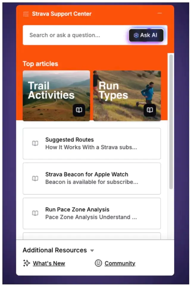
What if there are no appropriate results for users? Your platform should be able to point users in the right direction.
Bots or resources should connect users to the right expert. Or, users can submit in-app feedback to inform your onboarding product team. Your team can then address and implement the improvements within the product tour experience.
Ultimately, the key is understanding user behavior to balance contextual guidance with robust resources to educate your users about your app’s features. After experiencing a smooth tour and seamlessly activating by experiencing the valuable “aha” moment, users can identify your product's use case and value.
Example of an effective UI search tour
Once we understand our target users and create a friendly, personalized UI search experience, we can build an effective onboarding pipeline for better adoption and user retention rates.
One notable example is the popular project management tool, Monday.com.
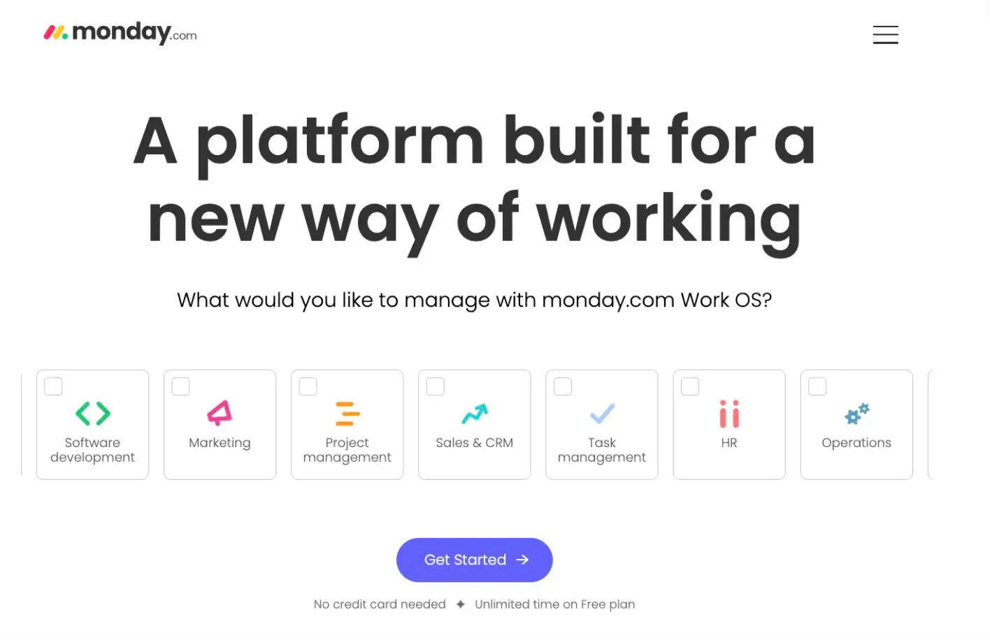
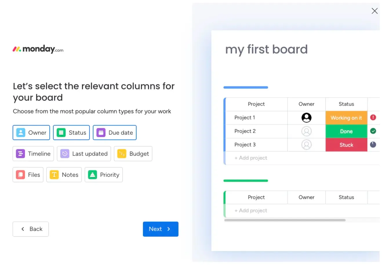
Right off the bat, Monday provides a pleasant onboarding experience. It asks you why you want to use the app, and then it helps you choose optimal columns and categories for tasks based on the information you provide. The interactive guide offers users a personalized, relevant activation experience.
What differentiates the experience is the search feature. When you click for help, an interactive search bar pops up.
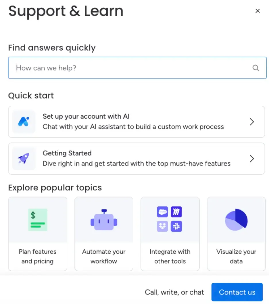
This window encourages users to search for questions or concerns and provides relevant resources.
Not only is the universal search helpful, but the in-app experience also supplies suggestions. Users can “quick start” and follow specific journeys. This may include trying out the app’s AI features or “getting started” by digging deeper into core features.
The search section provides popular topics based on their custom behavior research and understanding.
Users can also contact a representative for customer support for more help.
These search experiences provide an optimized, authentic user relationship with the platform that increases product adoption and nurtures customer loyalty.
Interactive, AI-powered search experiences
Brands and product managers can implement an experience similar to Monday.
They can also add a search experience powered by AI assistance.
Onboarding tools like Command AI’s Copilot offer 24/7 chat capabilities. Users can ask questions on brand websites. The AI uses your web pages, documentation, and many of your resources to inform its response. Users can easily experience a personalized onboarding flow.
The future for the best product tour software
Command AI recently interviewed Michael Maximoff, Co-founder of Belkins, the B2B lead generation company. Maximoff described their approach to the onboarding process, “...the future leans heavily towards intelligent analytics, intuitive design, and personalization elements.”
Focused, interactive product tours based on user behavior are the key to creating an onboarding strategy for today’s needs and tomorrow's shifts.
Self-guided tours will continue to evolve, especially during a time when user attention is scarce.
Users want to explore and get right to the action. Your job is to provide your unique value as soon as possible. Using tools like Command AI means new users experience non-intrusive, interactive walkthroughs.
Increase customer loyalty and retention rates—and decrease churn—by adopting a powerful product tour software that not only understands how to communicate your platform experience, but also understands real customers.
