Empower users and amplify growth with modern product walkthroughs
While demos aim to sell and impress, tours familiarize users with a product’s structures, and walkthroughs teach practical usage.


There are two things our team at Command AI knows for sure about onboarding:
One, no matter how sleek your UI or how intuitive your workflows are, there will always be that moment when a new user needs a little guidance - cue the dreaded product walkthrough.
Two, users hate feeling trapped in a one-way data dump, forced to passively consume an endless list of functionalities they'll likely never use.
But what if your walkthroughs could be something more? What if they could be a chance to genuinely excite your customers about your product's potential, effortlessly guide them through core functionality, and foster real connection and confidence?
They 100% can. And yes, we’ll explain how.
Demos vs. tours vs walkthroughs
Before we get into it, let’s just clarify what each of the above is:
- Demo: A comprehensive presentation showcasing a product’s overall value and capabilities. This is very infomercial and advertise-y. A bit meh.
- Tour: A high-level, automated overview of a product interface and main features, orientating years to the product’s layout. Has it’s place, for sure.
- Walkthrough: An interactive, step-by-step guide leading users through specific tasks or features. It’s more hands-on and contextual, appearing when users access certain features. This is what your users don’t know they want and need.
In short, while demos aim to sell and impress, tours familiarize users with a product’s structures, and walkthroughs teach practical usage.
The case for short, contextual walkthroughs
Many SaaS onboarding experiences make users want to tear their hair out because they’re stuck in the dark ages of learning theory. Back in the ‘70s, American educator David Kolb figured out people learn best by doing, not reading encyclopedic user manuals.
Yet, somehow, a ton of SaaS products missed the memo.
Two reasons why (some) SaaS walkthroughs suck👇
- They’re about as contextual as a snowboard in the Sahara. Genetic tooltips rarely fit what users are trying to accomplish.
- They drain the life out of learning. Passive feature tours are as exciting as watching a sloth run a marathon.
Say hi to the concise walkthrough
So, how do you turn your snooze-fest tours into engaging, effective onboarding experiences?
- Laser focus: Zero in on one specific task or feature at a time, like a dog with a single-minded obsession with that tennis ball. No squirrels are allowed in this learning park.
- Action-oriented: Show, don't tell AKA Guide users through actual actions. You’re not here to write a novel about buttons - you’re here to get users to push them.
- Progressive disclosure: Reveal information gradually, like you're training a baby bird—in small, digestible chunks that won't ruffle any feathers.
- Visual appeal: Use eye-catching design to maintain engagement. Dress it up fancier than a penguin in a tuxedo. If it doesn't make users' eyeballs do a happy dance, you've got work to do.
- Immediate value: Deliver satisfaction faster than a cat video delivers laughs. Every click should feel oddly satisfying and weirdly addictive.
FYI: Doing all of this is only half the battle.
The real magic happens when you tap into behavioral triggers
Concise, contextual walkthroughs deliver essential information at the right moment.
You achieve this by leveraging specific user actions or patterns that signal the ideal time to introduce guidance.
Common user triggers include:
- Confusion signals: Rapid clicking, hovering without action, or repeated navigation to the same area.
- Feature discovery: When a user first encounters a new or complex feature.
- Inactivity: If a user hasn't engaged with a key feature after a certain time.
- Error states: After a user encounters an error or failed action.
- Milestone achievements: Celebrate and guide users to the next level after completing important tasks.
Leverage these triggers, and your walkthroughs become dynamic, personalized assistance. It’s like designating a friendly expert for every user, ready to help when needed. Unobtrusive and effective.
Take it a step further with on-demand walkthroughs
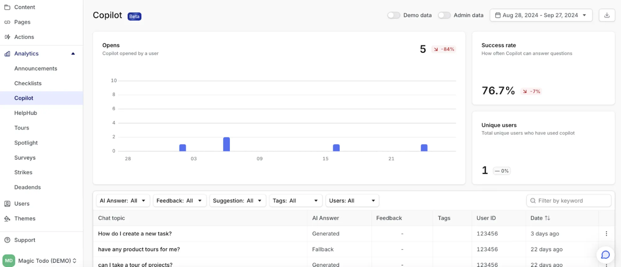
Why stop there? You can give your users the power to get help when and how they want it. That's what a HelpHub or Copilot can do (Command AI also offers both capabilities).
A centralized HelpHub is a knowledge command center where users can easily search for and launch specific walkthroughs. It's like having a friendly librarian who is always ready to point you to the right book.
(Aside: Thanks to smart page targeting, Command AI’s HelpHub provides relevant content to users based on where they are in the product. And you can customize user experience based on account tier, feature access, and product usage history.)
https://drive.google.com/file/d/1XPO9dUt1WYnCqwtMgGsoJr_9R2frDLR5/view?usp=sharing
See Command AI’s Copilot in action
On the other hand, a Copilot interface takes things a step further, offering a more conversational and contextual help experience. Users can simply ask questions in natural language and get pointed to the relevant walkthrough or even have it launch automatically.
(Aside: Unlike annoying pop-ups that know nothing about user needs, our Copilot learns from users to provide relevant and personalized guidance. We’ve designed it to avoid AI hallucinations, ensuring users get accurate assistance to master your software.)
Both of these tools are highly beneficial
On-demand, self-paced learning respects users' time and learning preferences. Some users want to learn about every feature immediately, while others prefer to explore gradually.
HelpHubs and Copilots also reduce cognitive load. Instead of bombarding users with information they might not need, they can absorb knowledge in digestible chunks, which leads to better retention and skill application. Plus, immediate assistance reduces frustration without interrupting workflow.
Then, there’s also the confidence that comes with learning without feeling rushed, which translates to more adventurous product use and higher satisfaction.
How to personalize walkthroughs
Tailoring what you present and how you present it to each user’s unique profile makes your walkthroughs even more engaging and relevant.
A user’s role
For example, a walkthrough for a project management tool could emphasize different features for team leaders versus individual contributors. Team leads might see more content about assigning tasks and generating reports, while individual contributors focus on time tracking and collaboration tools.
User activity patterns
If there are features that aren't being used much but could really help a user out, maybe it's time for a friendly intro walkthrough. On the flip side, if you notice users keep hitting snags with certain tasks, why not give them a hand with some step-by-step guidance? It's all about making things smoother and helping everyone get the most out of what you've built.
Historical data
Similarly, if a user has already completed a tutorial or task by following previous guidance, you can tailor their experience. Monitor their progress and past interactions so they can skip the stuff they know and focus on what's new. This way, each walkthrough feels like a natural next step, building on what they've learned and keeping things fresh and relevant.
How to measure walkthrough success
These metrics help you fine-tune your walkthrough into a smooth, engaging experience that keeps users moving forward with confidence. Remember, every click (or lack thereof) tells a story about your users' experience.
Completion rate
A high completion rate is a good reason to celebrate—it indicates your walkthrough is doing its job, keeping users interested and providing real value. But don't neglect users who don't make it to the end. Look closely at where they're dropping off. Maybe there's a tricky step, or you're asking too much too soon. Whatever the case, these drop-off points highlight opportunities to refine and improve your walkthrough.
Time to complete
Your goal is to create a "just right" experience—not too fast or slow. Every second counts to keep users engaged and informed. If users rush through or take too long, it may indicate that the content needs adjustment.
Feature adoption rate
A successful walkthrough should increase feature usage, demonstrating that users value your product's capabilities. Are they confidently navigating to those shiny new features you've showcased? Or are they sticking to the basics, unsure how to venture further?
Retention rate
Compare the retention of users who completed the walkthrough versus those who didn't. A well-designed walkthrough should increase long-term retention as users understand your product's value better. Short, contextual walkthroughs aim to make a good impression that spurs lasting loyalty.
Engagement metrics
These are your walkthrough's vital signs, giving you a peek into how users interact with each step of their journey. Track metrics like user annoyance. Do they incessantly click over specific buttons? Or are they lingering on a particular page? Or are they zipping through? Like, maybe that clever animation is a hit, or perhaps that wall of text is causing eyes to glaze over.
Walkthroughs that wow, are the secret to sticky SaaS
Your walkthrough should be less like that annoying backseat driver who won't stop yelling, "Turn left! No, your other left!" and more like that chill friend who conveniently pipes up 500m before you make a turn.
Embrace behavioral triggers, on-demand help, and personalization. You're not just onboarding users—you're revealing your product's full potential. Get this right, and users will stick around, features will get the love they need, and your product will become a mainstay in their lives.
Keep it short and sweet, and, for the love of all things SaaS, keep it relevant and contextual.