What is survey fatigue and how to avoid it
Discover key tactics to avoid survey fatigue in SaaS, ensuring higher response rates and quality feedback from your in-app surveys.


Formula 1 drivers arguably have the fastest reaction times in the world. Through rigorous training, they hone their reaction speeds.
But I’m willing to bet my reaction speeds are quicker, especially when it comes to dismissing in-app surveys.
“Hey, do you have a minute to answer this quick survey?”
“NOPE!” click
Everyone who uses software is suffering from survey fatigue. No one enjoys surveys, especially annoying in-app surveys. They’re often laborious, tedious, and soul-sucking. Half the time, the questions feel repetitive, misaligned, and pointless.
What if I told you there was a way to read your user’s minds without sending them any surveys at all?
In this article, I’m going to walk you through how to not only reduce in-app survey fatigue but also how to avoid using in-app surveys at all (and still get the insights you’re looking for!)
What is survey fatigue?
When it comes to surveys, users have become disinterested and less responsive. We call this survey fatigue. In much the same way as physical fatigue, survey fatigue grows steadily and over time until it reaches a breaking point.
Surveys used to feel novel. As a once-off, users would be inclined to answer an in-app survey either out of respect, obligation, or even curiosity. Over time, though, as product and UX teams are flooding users with more and more in-app surveys, fatigue has reached an all-time high.
What causes survey fatigue?
There are several factors that contribute to survey fatigue. Some of the most common are:
- Overexposure: Frequent in-app surveys overwhelm and desensitize users.
- Length and complexity: Long, complicated surveys feel daunting from an effort output perspective.
- Lack of perceived value: Users are less motivated if they don’t believe their feedback will be utilized.
- Repetition and redundancy: Poorly formatted questions feel like a waste of time.
- Inconvenience: Most in-app surveys are annoying and abrasive, interrupting users.
Any one of these factors alone is enough to trigger survey fatigue, but when they’re combined, users understandably become less responsive much quicker.
Why is survey fatigue a problem?
To understand why survey fatigue is a problem, we should first consider why you need surveys in the first place. In my opinion, there are really one three reasons why we use surveys in SaaS:
- Customer feedback
- Product development
- Market research
Without any of this data, it becomes incredibly difficult (albeit not impossible) to build great products. Survey fatigue can become a critical blocker in your cycles if it goes unchecked.
If you’re like most product people and you’re still relying on in-app surveys, here’s how survey fatigue could be negatively affecting your survey results.
Reduced response rates
This is the glaringly obvious but users who are suffering from survey fatigue are hardly going to be prioritizing completing your in-app surveys. If fewer of your users are responding, that’s going to dilute the effectiveness of the results.
Low-quality responses
Users who are survey fatigued are far less likely to take their time and give meaningful responses. The likeliest behavior is that users race through the questions as quickly as possible just to get through it. I’m guilty of this one. I often skim read questions and rage click my way through them as quickly as I can to get it finished.
Biased results
A portion of your users have the tenacity of a golden retriever. No matter what in-app survey you throw their way, they’ll dive in and complete it. On the flip side, though, you have a segment of users who are so survey-fatigued that they won’t even bother filling it out at all. This survey fatigue-induced self-selection bias means you’re getting skewed results and only sampling a portion of your (most eager) users.
Resource wastage (thrash)
Crafting in-app surveys requires a lot of planning. You’ve got to consider targeting, segmentation, UX copy, deliverability, hypotheses, and outcomes. Spending precious time building out in-app surveys that potentially no one will respond to and combing through low-quality results is a waste of team resources.
How to reduce survey fatigue?
Let’s assume your boss is mandating you send out in-app surveys. So cringe. You have two options:
- You read this section on reducing survey fatigue
- Or you skip this section and read the next bit on how to gather all the insights you’ll ever need without sending any surveys at all (and you send this article to your boss).
If you’re still reading this, I guess you’re begrudgingly looking for ways to send out in-app surveys without fatiguing your users. Let’s dive in.
Keep surveys short and sweet
Reducing in-app survey fatigue is all about limiting the impact they have on your users. The easiest way to do this is the dial down the length of the survey. The shorter it is, the more likely users will actually complete it.
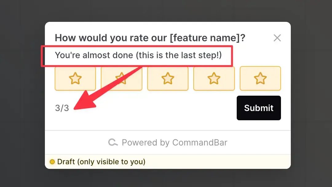
Using a visual guide like a progress bar, a completion percentage, or some encouraging UX copy like “You’re almost done” is generally a great antidote to survey fatigue.
Make surveys relevant and timely
As a crude example, say you want to get feedback on a particular feature that’s only available to paying users. Sending your survey out to a segment of users that are both on the free and paid plans would be a complete waste of time and potentially damaging from a branding position.
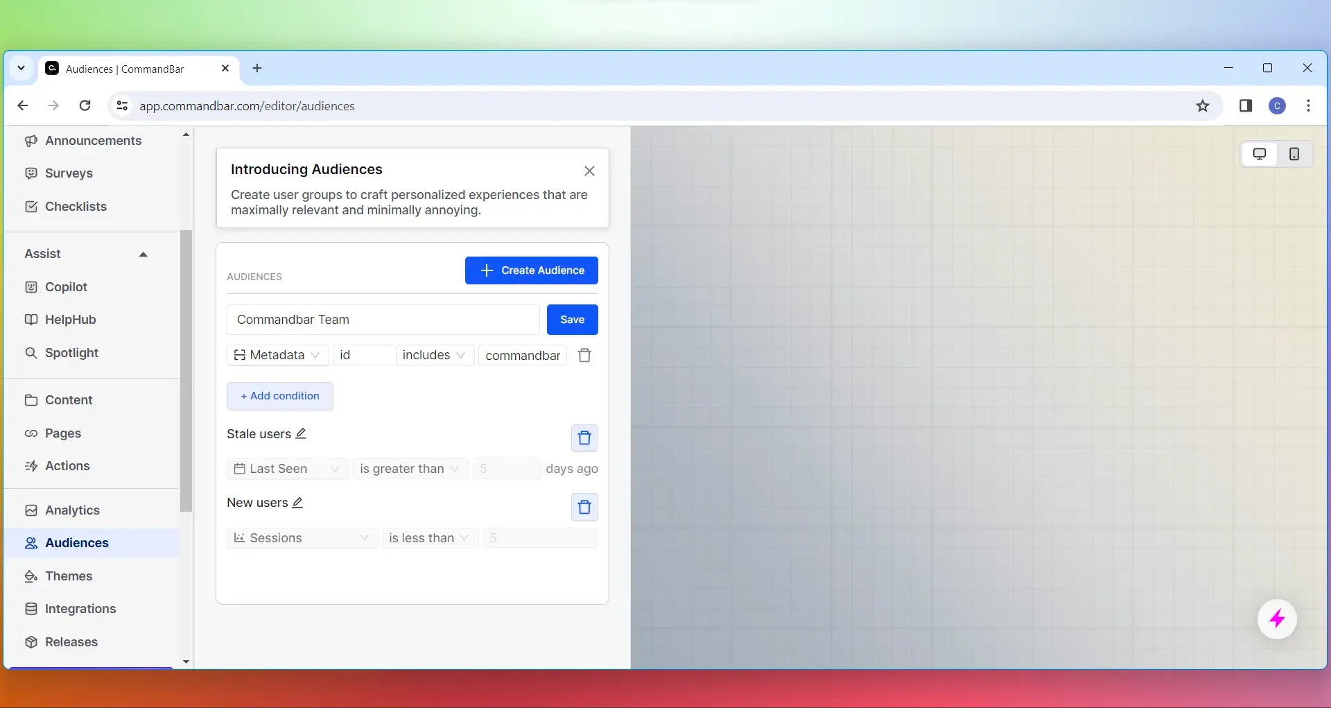
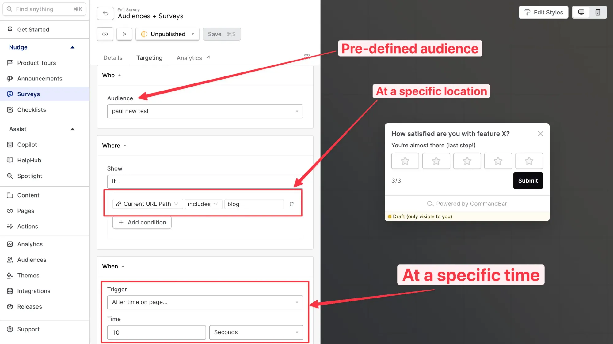
In Command AI, we make it super easy to segment users into audiences based on a ton of variables, including actions, environment, and behaviors.
From here, you can deliver your in-app surveys explicitly to the users you want, ensuring survey fatigue is reduced and your in-app surveys are non-annoying.
There are infinite ways you can decide who, where, and when to deliver in-app surveys to with Command AI. The example below is a very basic page-specific time delay.
Offer incentives to complete surveys
Sometimes, dangling a carrot is a great way to motivate users to complete your in-app surveys. Offering feature access or monetary incentives is a tried and true means of increasing survey completion. The likelihood that you’ll get respondents is dramatically higher, though you may introduce some bias in the quality of your results.
How to avoid survey fatigue completely?
If you’ve gotten to this section because you’re sick of pumping users with in-app surveys and don’t want to be about that life anymore, you’re in the right place. Most surveys are annoying and the results generally aren’t reliable. Instead, I have a better option for you.
You can gain just as valuable qualitative and quantitive insights by exploring user intent and analytics.
Why user intent is more powerful than surveys
If “actions speak louder than words”, then why are we wasting time seeking insights and opinions via in-app surveys? Instead, peek at what your users are doing inside your app to understand what their needs are without causing any user friction at all.
One of the most obvious places to see that user intent is in search.
If your entire app ecosystem and help resources are accessible within a unified search experience, in-app help docs, or an AI-powered user assistant, you’ll uncover incredible insights about what actions users are taking and what they need help with (without prompting or interrupting them with an in-app survey.)
In other words, you can read their minds.
Harnessing deadends to guide product development
Typically search results are like a trail of breadcrumbs. Combining search queries with user actions, we can build a narrative about what the user wants and needs. When the trail of breadcrumbs dries up, we traditionally look to other tools like in-app surveys to help paint a picture of user needs and desires.
A core function of surveying users is to gather information that will influence and validate product development decisions. However, as you’ve read so far, survey responses aren’t always reliable.
To see exactly where your app or help resources are falling short of users’ needs and expectations, you should investigate “deadends”.
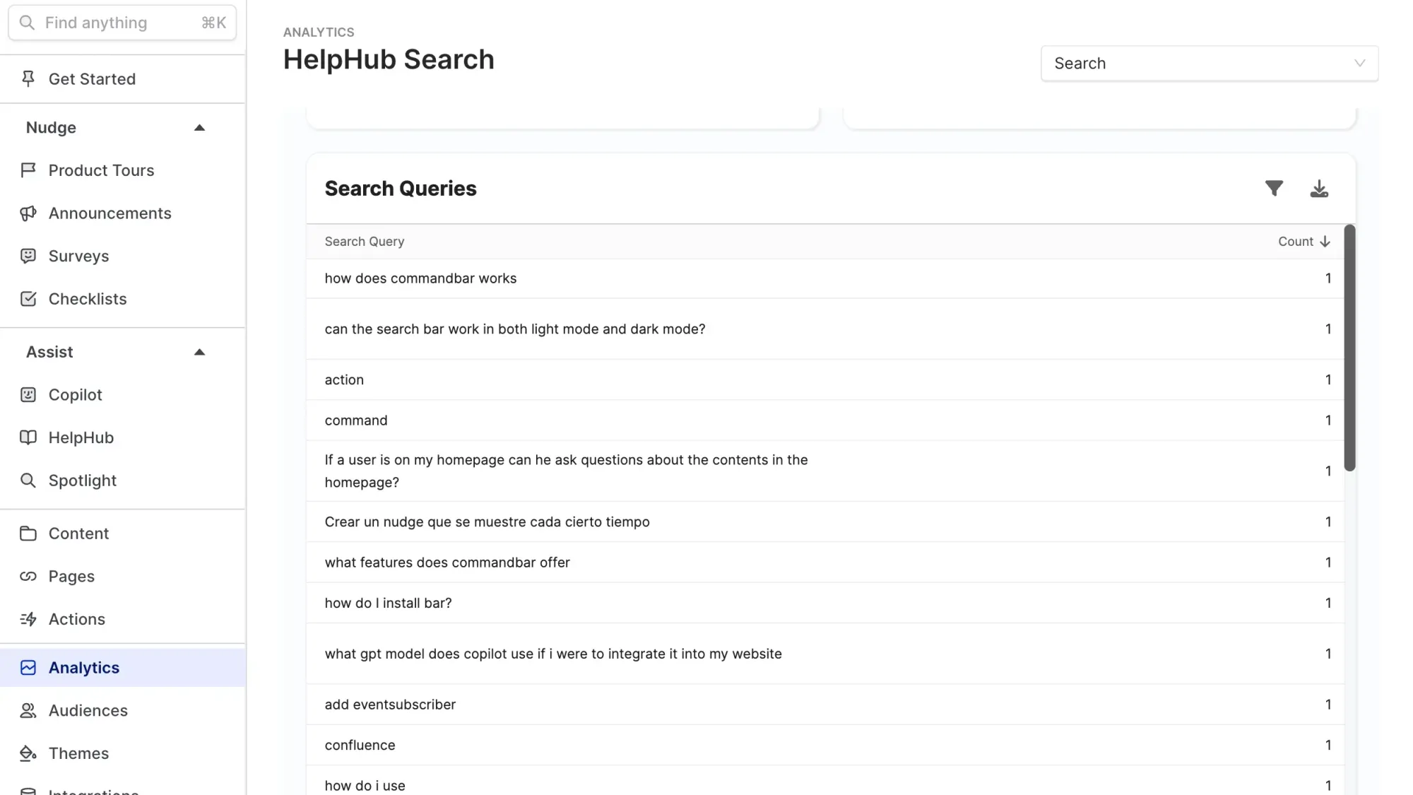
A deadend is a search that doesn't end in a successful outcome for your user.
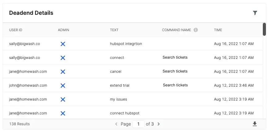
In the fictitious screenshot above, you’ll see Sally was looking for a Hubspot integration, but there was none. The search ended in a deadend.
This implies Sally is sad. It also implies that Sally may want a Hubspot integration. Let’s continue to play this out over a larger sample set. Imagine you start to notice more deadend searches for a Hubspot integration across your entire user base. It’s probably a great opportunity to do a little more research on building out that integration, huh?
The takeaway here is that instead of battling with survey fatigue, just bypass it. Dive into the data you already have to help guide and influence product decisions.
Final thoughts
It may come across as a little paradoxical that I’ve just spent the last seven minutes of your life arguing that in-app surveys (a prominent feature in Command AI’s product suite,) is redundant. Truthfully, I don’t believe in-app surveys are redundant at all. I do, however, strongly believe that annoying popups should be banished forever.
No wonder users are suffering survey fatigue when they’re constantly being bombarded with popups that are inconvenient, useless, and irrelevant.
If you take one lesson from this post, it’s to reduce survey fatigue by not sending surveys at all and if you have to, make sure you’re targeting is dialed in tight before you ship any in-app surveys.